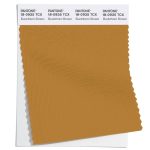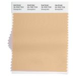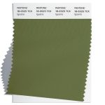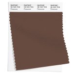
Select Page
Pantone® announce the Color of the Year 2024

Pantone® announce the Color of the Year 2024

Pantone® Colour of the Year 2024

As always, December is bonkers busy with the build up to Christmas getting earlier and earlier each year, along with all the school events and several birthdays to navigate before we can collapse in a big (usually ill) heap at the end of the year!

Meanwhile, there is also the exciting news of the Pantone® colour of the year. And 2024 is a special year as it marks 25 years of this momentous trend movement.

Recently, when the Spring 2024 colours were published, my guess for the colour of the year was for a bold sunny orange (as we haven’t had an orange since 2012). Now whilst this week’s announcement is for a slightly more pastel version, I’m claiming that my prediction for an orange tone was pretty near the mark.

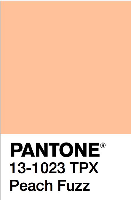
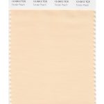
Peach Fuzz 13-1023

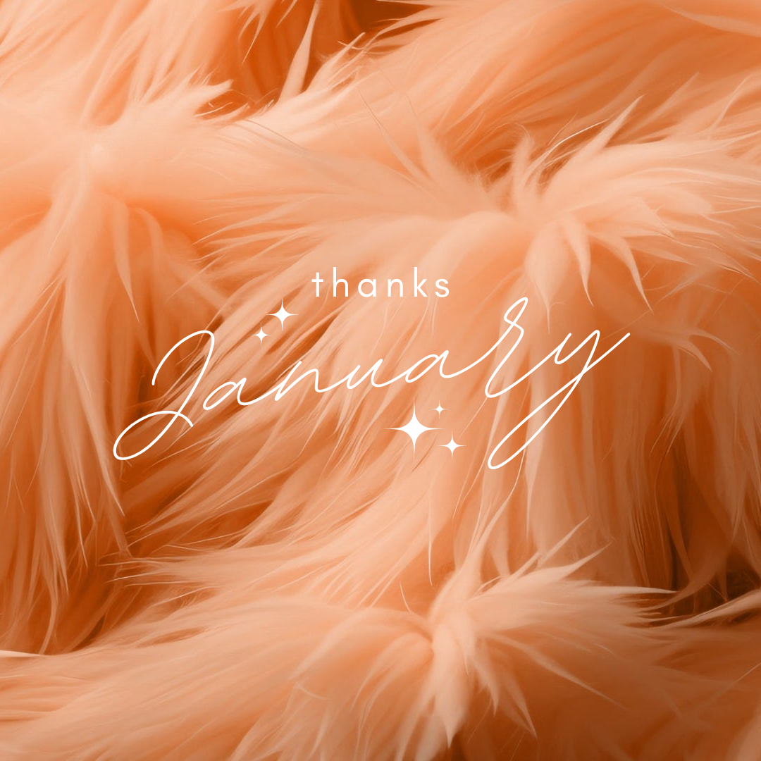
Pantone® have announced that Pantone® 13-1023 Peach Fuzz is the colour of the year for 2024, somewhere between a pale pink and orange colour.

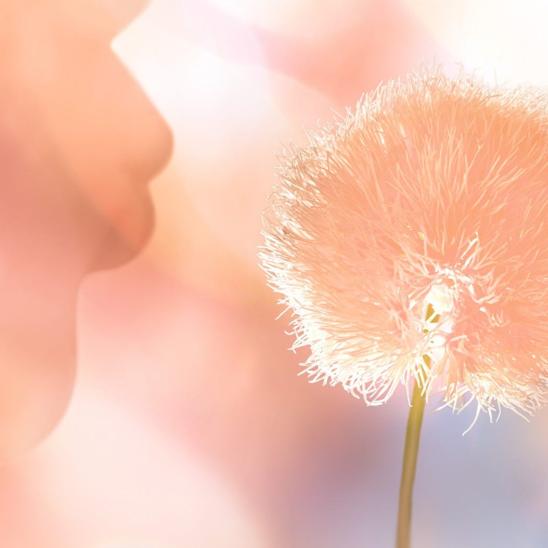
Peach Fuzz has been described by Pantone® as “a gentle and nurturing peach shade that serves as a reminder to slow down and care for ourselves and one another. The romantic color’s name reflects the tactile sensuality associated with the hue: velvety peaches, soft marabou feathers, and smooth vintage satins and silks all come to mind when thinking about the pink and orange combo.”

The Pantone Color Institute’s executive director Leatrice Eiseman points out that the “delicate shade summons viewers to the human experience, with an emphasis on the importance of health and wellness for mind, body, and soul. From the warm colors of a sunrise or sunset to the coziness of a fuzzy blanket, the color affirms moments of internal tranquillity with the deep need for community, gathering, and connection.”

25 years of Pantone®

Orange is no stranger to being the colour of the year with a bright shade of Living Coral in 2019, a deeper Tangerine Tango in 2012, a pale Sand Dollar in 2006, plus Tiger Lily back in 2004.

There have also been some sunny yellows over the years in the form of Illuminating in 2021 and Mimosa in 2009.

Spring 2024 predictions

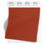
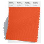
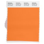
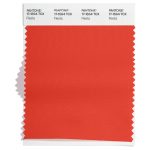
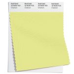
Once again, this colour doesn’t appear exactly in any of their seasonal predictions, although there were a number of yellow and orange sunset colours at both New York and London Fashion Weeks including Rooibos Tea, Orangeade, Lemon Drop, Spicy Mustard, Sun Orange, Fiesta and Charlock.

Protection

What does the name of the colour of the year mean? Well, there are over 300 varieties of peaches. And the fruit is deemed very important in Chinese culture as it can symbolise fertility and long life. The fuzz on peaches is actually a form of protection as it repels excess water away from the skin to stop it rotting prematurely. Additionally the fuzzy texture keeps insects away to stop them from destroying the fruit.
Cheeky

Peach Fuzz wouldn’t be out of place as the name for a cooling peach schnapps drink over a glassful of ice. Likewise, the peach emoji can also signify another way of saying ‘bottom’ on social media. And sometimes it can refer to the soft fine unwanted hair on cheeks.

Blush tones

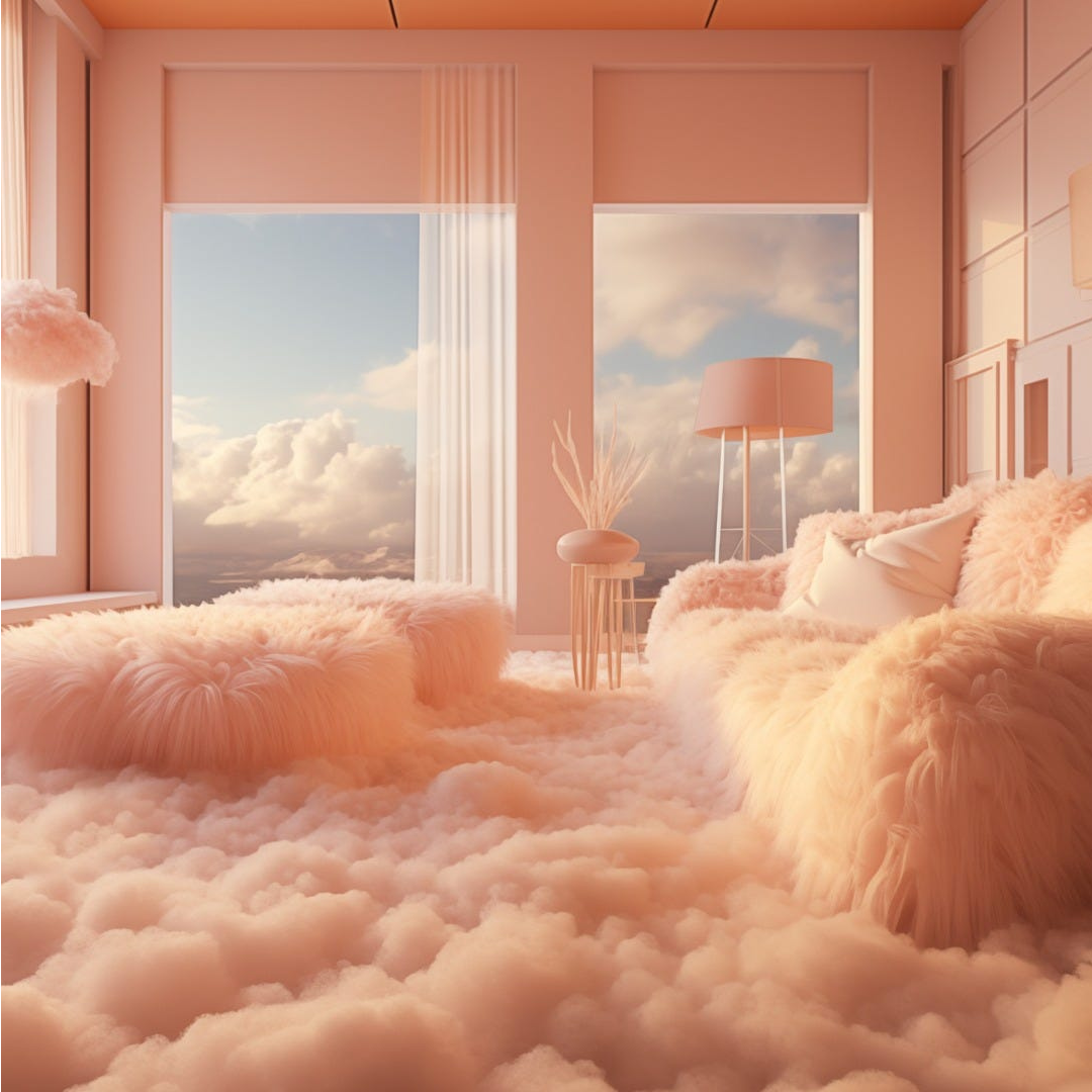
But to me, this colour of the year for 2024 feels soft, romantic and peaceful. A beautiful warm sunset over clouds. It appears as lights as a feather, like a stick of candy floss at the beach or a full puffball netting skirt billowing in the wind.

Peaches and cream

There are so many wonderful sayings with the word ‘peach’ in them which usually mean something good about life. The expression has come to mean something which is particularly good or sweet, such as ‘Everything is peachy!’

Looks like Peach Fuzz will bring a relaxing and peaceful vibe for 2024 – with a touch of cheekiness!

#COY2024

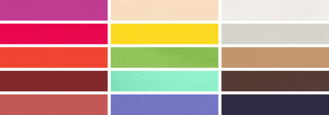
Top Spring 2024 colours from Pantone®

Top Spring 2024 colours from Pantone®

Spring 2024

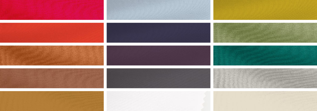
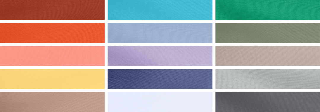
Following the recent fashion weeks, Pantone® have revealed the Spring/Summer colours to look out for in 2024 including 10 seasonal colours alongside 5 neutral classics.

The seasonal colours feel like a refreshing palette cleansing selection full of the warming sun, cooling drinks relaxing in tropical climes.

The Pantone Color Institute’s executive director Leatrice Eiseman said “Colours for Spring/Summer 2024 are infused with a hint of nostalgia yet at the same time speak to transformation as we embrace a more positive way of living. A new sense of freedom is reflected in this palette of evocative yet familiar tones that open the door to the exploration of our creative potential to re-visualise the future.”

“Colours for NYFW Spring 2024 inspire feelings of release. Opening the imagination and amplifying and liberating our own unique artistic spirit, they enable us to express ourselves in more inventive ways”.

warming

On a cold autumnal night, sometimes the only thing that is warming is clutching a hot tea in front of the fire and we can only dream of warmer weather.

These Spring colours evoke the sunny weather ahead in the form of fragrant citrus fruits as well as spicy mustards and chutneys to warm from the inside.

cooling 

The pastel palette of greens, pink, blue, lilac and lemon are so cooling and refreshing like a mint filled mojito drink, enjoyed lying in a hammock beside sun bleached houses painted in these faded shades.

tropical  

These Spring colours once again evoke beautiful summer holiday destination aspirations. With bold blues, coral, lavender and blazing sunshine.

Spring 2024 colours

The top ten colours for Spring 2024 from NYFW are:
  • 18-1355 Rooibos Tea
  • 17-1461 Orangeade
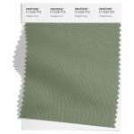
  • 17-0220 Watercress
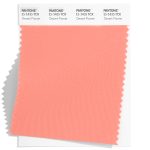
  • 15-1435 Desert Flower
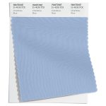
  • 15-4030 Chambray Blue
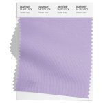
  • 14-3812 Pastel Lilac
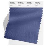
  • 18-3932 Marlin
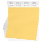
  • 12-0736 Lemon Drop
  • 16-5938 Mint
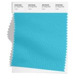
  • 15-4722 Capri

Spring 2024 extra colours from LFW

In the main, the colours are repeated at London Fashion Week, albeit with darker shades of blues and greens at LFW.

The focus shifts from the cooling pinks and purples of NYFW to warming yellow and orange colours at London Fashion Week.

Here are the colours from LFW to round off the colours for Spring 2024:

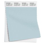
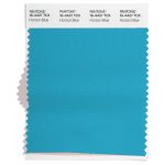
  • 16-4427 Horizon Blue
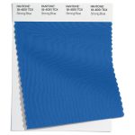
  • 18-4051 Strong Blue
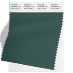
  • 19-5408 Bistro Green
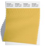
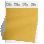
  • 14-0952 Spicy Mustard
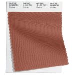
  • 18-1433 Chutney
  • 16-1257 Sun Orange
  • 17-1564 Fiesta
  • 12-0530 Charlock
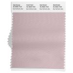
  • 15-1905 Burnished Lilac
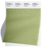
  • 15-0326 Tarragon

Neutral classics

Pantone® have also updated the Classic Colour Palette. These neutrals are core basics in the form of a white, creams, beige, greys and black. They feel like rainy day classics – perfect grounding colours and peaceful additional accompanying colours.

The bonus classic neutral colours for Spring 2024 are: 

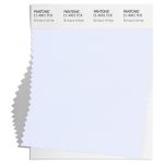
  • 11-4001 Brilliant White
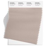
  • 14-1305 Mushroom
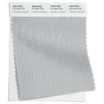
  • 14-4104 Northern Droplet
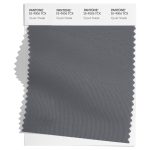
  • 18-4006 Quiet Shade
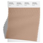
  • 16-1317 Brush

And at LFW these are:

  • 11-4001 Brilliant White
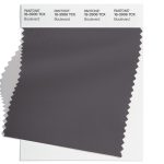
  • 18-3906 Boulevard
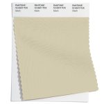
  • 13-0611 Moth
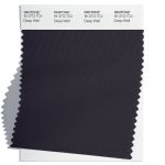
  • 19-3713 Deep Well
  • 14-4804 Blue Fox

Colour themes

Colour plays an important part in our lives and it’ll be interesting to see how these colours filter through to influence things around us.

Pantone® is the world-renowned authority on colour and the Pantone® Color of the Year is always really influential in any popular colour themes in fashion, interior design and weddings.

Look out for my report when the 2024 colour of the year is released later in the year. My guess is for a bold sunny orange – we haven’t had an orange since 2012.

Top Autumn 2023 colours from Pantone®

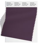
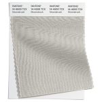
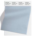
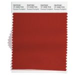
Top Autumn 2023 colours from Pantone®

Shortages

At the time of writing, some vegetables are being rationed at some supermarkets due to poor weather in the countries where the produce is grown. We just for granted that whatever the season and time of year, that we can have any type of possible fruit or vegetable. We are disappointed not to be able to buy tomatoes at the moment but realistically they aren’t really in season.

Since lockdown and more so in recent times of economic uncertainty and a cost of living crisis, it has become apparent and more important to me that we should eat seasonally, buy locally and even grow our own produce. To not only help our pockets but to make sustainable choices for the environment too.

Paralleled with this, for Lent I had decided to ‘give’ this year, rather than ‘give up’. Like I did at Christmas with a reverse advent calendar, I am giving something each day of Lent to the local foodbank.

Autumn 2023 colours

All these thoughts of seasons is quite timely, as whilst we are on the brink of Spring, my thoughts are drawn to the end of the year with recent fashion weeks in New York, London and Milan this month, and Paris next month.

From these fashion weeks, Pantone® have predicted 10 colours that they think will be prevalent in Autumn/Winter 2023/24 which all evoke an earthy, back to nature vibe in keeping with my current food seasonality thoughts.

Forest school

Nothing quite beats a crisp morning surrounded by nature. With trees sheltering you away from technology, away from noise, away from any stresses. Just exploring and being present. Then warming up round a roaring fire, cradling a warm mug of hot chocolate. Some of the colours ooze autumnal vibes, like the changing colours of the leaves as they fall from the trees. With reds, burnt oranges, browns and yellows flickers of the fire.

Winter getaway

These warming colours are contrasted with the icy cold winter days of a winter skiing scene, such as turquoise, lilac and bright blues reminiscent of cloudless skies and mountain ranges.

Fresh vegetables

Finally, there is a sense of freshness in the cool green shades eluding to any harvesting crops perhaps of Kohlrabi (which is in season now), Olive Oil and Sharp Green.

Fall 2023 colours 

The top ten colours for Fall 2023 from New York Fashion Week are:
  • PANTONE 12-0912 Tender Peach
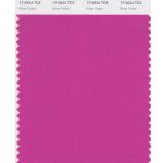
  • PANTONE 17-2624 Rose Violet
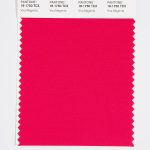
  • PANTONE 18-1750 Viva Magenta
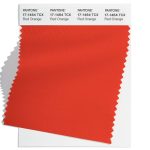
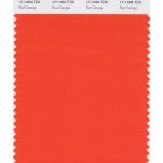
  • PANTONE 17-1464 Red Orange
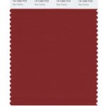
  • PANTONE 19-1555 Red Dahlia
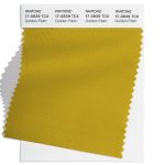
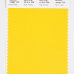
  • PANTONE 13-0751 High Visibility
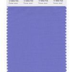
  • PANTONE 17-3934 Persian Jewel
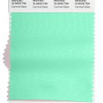
  • PANTONE 13-6030 Carnival Glass
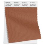
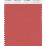
  • PANTONE 17-1544 Burnt Sienna
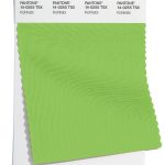
  • PANTONE 14-0255 Kohlrabi

Fall 2023 extra colours from LFW

Most of the colours have the same vibe at London Fashion Week, with some slightly different hues. The noticeable differences were the oranges at NYFW (of Tender Peach and Red Orange) which were replaced with a purple and bright blue at LFW.

Here are the colours for Fall 2023 from LFW:

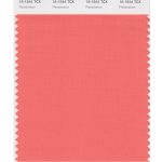
  • PANTONE 16-1544 Persimmon
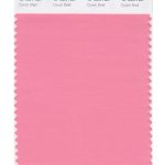
  • PANTONE 15-1624 Conch Shell
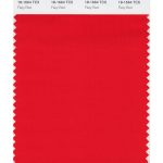
  • PANTONE 18-1664 Fiery Red
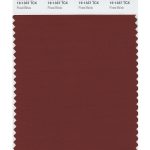
  • PANTONE 19-1337 Fired Brick
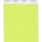
  • PANTONE 13-0535 Sharp Green
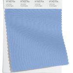
  • PANTONE 14-3921 Lacecap Hydrangea
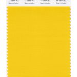
  • PANTONE 14-0957 Spectra Yellow
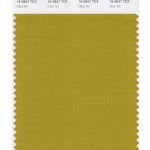
  • PANTONE 16-0847 Olive Oil
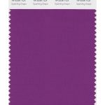
  • PANTONE 19-3336 Sparkling Grape
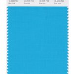
  • PANTONE 16-4535 Blue Atoll

Neutral basics

Pantone® have also created a Fall 2023 Classic Colour Palette. These are a group of neutrals that are core basics in the form of white, navy, an earthy brown, light grey, plus a rich beige.

The bonus classic neutral colours for Fall 2023 from NYFW are:

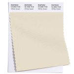
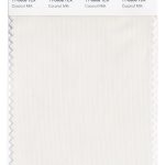
  • PANTONE 11-0608 Coconut Milk
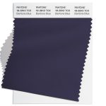
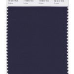
  • PANTONE 19-3810 Eclipse
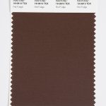
  • PANTONE 19-0913 Hot Fudge
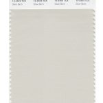
  • PANTONE 13-4403 Silver Birch
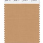
  • PANTONE 16-1333 Doe

    The Fall 2023 Classic Colour Palette at London Fashion Week swapped out the navy and earthy brown, for a dark forest green and a dark grey. They are:

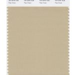
    • PANTONE 15-1216 Pale Khaki
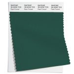
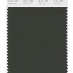
    • PANTONE 19-0414 Forest Night
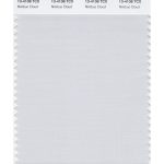
    • PANTONE 13-4108 Nimbus Cloud
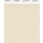
    • PANTONE 12-0703 Seedpearl
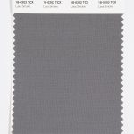
    • PANTONE 18-0202 Lava Smoke

        Colour themes

        Colour plays an important part in our lives and it’ll be interesting to see how these colours filter through to influence things around us.

        Pantone® is the world-renowned authority on colour and the Pantone® Color of the Year is always really influential in any popular colour themes in fashion, interior design and weddings.

        Crepuscula is my word of the moment

        Crepuscula is my word of the moment

        Crepuscular

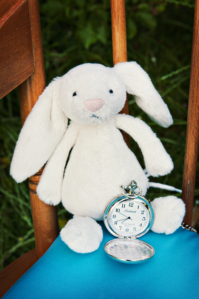
        I’m wondering whether I’m a crepuscular animal – more active at dawn and dusk. Compared with a nocturnal animal (active at night) or diurnal (active during the day).

        Crepuscular creatures like rabbits, deer, mice, rats, otters, many song birds, mosquitoes, and moths hide from their prey and the midday sun.

        I’m certainly busy at the beginning and end of the day (and then have revenge bedtime procrastination – forfeiting sleep for leisure time!)

        #wordoftheday #wordofthemoment #nationalthesaurusday #loveroflanguage #scrabbletiles

        Pantone® announce the Color of the Year 2023

        Pantone® announce the Color of the Year 2023

        Pantone® Colour of the Year 2023

        December is a super busy month in our household, with all the obvious build up to Christmas and all that entails (like several Christmas concerts today) but it is also birthday for two of my children!

        In amongst all that craziness, is the excitement of the announcement of the Pantone® colour of the year.

        Back when the Spring colours were published during the fashion weeks in September, my guess was for a bright green like Love Bird to be the colour of the year for 2023. After all we haven’t had a green since 2017.

        Viva Magenta 18-1750

        Instead, Pantone® have announced that Pantone® 18-1750 Viva Magenta will be the colour of the year for 2023, a bold raspberry pink colour. Ironically, on the day it was announced that was also the colour that my nails were painted. Maybe I subliminally knew anyway!

        It feels like an evolution from the calming, Classic Blue of 2020, to the vibrant Very Peri purple of 2022, and now a vivacious bright red/pink colour for 2023.

        Pink is no stranger to the colour of the year with a pale pink of Rose Quartz in 2016, and two more daring pinks as Honeysuckle in 2011 and Fuchsia Rose in 2001.

        There have also been no shortage of red shades to boost our confidence over the years in the form of Marsala in 2015, Chilli Pepper in 2007 and True Red in 2002.

        Spring 2023 predictions

        Once again, this exact colour doesn’t appear in any of their seasonal predictions, although there were a number of bright red, purple and pink colours at both New York and London Fashion Weeks (including Beetroot Purple 18-2143).

        Full of life

        Viva Magenta has been described by colour company Pantone® as “a shade rooted in nature descending from the red family and expressive of a new signal of strength”. Leatrice Eiseman, executive director of Pantone® Color Institute said that the Colour of the Year for 2023 “vibrates with vim and vigor. Viva Magenta is brave and fearless, and a pulsating color whose exuberance promotes a joyous and optimistic celebration, writing a new narrative.”


        “Pantone’s Color of the Year, Viva Magenta 18-1750 is powerful and empowering. It is a new animated red that revels in pure joy, encouraging experimentation and self-expression without restraint, an electrifying, and a boundaryless shade that is manifesting as a stand-out statement. Viva Magenta welcomes anyone and everyone with the same verve for life and rebellious spirit. It is a color that is audacious, full of wit and inclusive of all.”


        “Viva Magenta descends from the red family, and is inspired by the red of cochineal, one of the most precious dyes belonging to the natural dye family as well as one of the strongest and brightest the world has known.”

        At this time of the year, I’d be quite happy to hibernate and hide away but maybe it is time for a renewed vitality and to get back out there and enjoy life again. Looks like Viva Magenta will give us the much needed boost of energy for 2023.

        #COY2023

        Top Spring 2023 colours from Pantone®

        Top Spring 2023 colours from Pantone®

        Grey clouds 

        It has been a strange start to the new academic year. I’m usually fired up and ready to start afresh with new vigour and enthusiasm. I was all raring to go when the children when back to school (even though the weather had taken a sudden noise dive towards autumn without the usual tailing out of sunny days.) It was strange to be by myself after having someone around me for the last 11 weeks (due to a string of illnesses before the summer holidays) so I was determined to crack on with the ever expanding to do list. 

        And then came the very sad news out of the blue that our Queen, of 70 years, had sadly passed away.

        Rainbows in the sky 

        I was surprised by how I felt about the news and the emotions that I went through. It makes me so sad thinking about there being no Queen and it was like losing another Nan all over again.  The weather was dull, grey and rainy on the day that she died and then somewhat symbolically a double rainbow arched the sky that evening.  

        And a beautiful array of rainbow colours pretty well sums up the latest Pantone® announcement that predicts the colours for next year’s Spring and Summer. 

        Spring 2023 

        Following the fashion weeks, Pantone® have revealed the Spring/Summer colours to look out for in 2023 including 10 seasonal colours alongside 5 neutral classics.  

        There is an abundance of bright rainbow colours with a wonderful tropical vibe, alongside some soothing pastels.  

        The Pantone Color Institute’s executive director Leatrice Eiseman said “Colours for Spring/Summer 2023 are recalibrated for the new era we are entering. Blending escapism with reality, wholesomeness, and joy, we embrace the exploration of extreme contrast in mood and colour”. 

        Send her victorious  

        For me, many of the colours remind me of how bold the Queen always used to dress in her matching hats and jackets in bright colours. She often wore a solid colour from head to toe so that she stood out and was easily visible. You never caught her wearing a depressing colour.  

        Colours like Empire Yellow, Classic Green, and Beetroot Purple are perfect examples of colours that would have been great as outfits fit for the Queen. 

        Queen Elizabeth II was famed for saying, “If I wore beige, nobody would know who I am.” 

        Stand out rainbow colours 

        The rainbow colours give such a positive outlook for next year and you can clearly spot a complete rainbow in the Spring line up of colours: 

        • Red – Fiery Red
        • Orange – Tangelo
        • Yellow – Empire Yellow
        • Green – Classic Green
        • Blue – Summer Song
        • Indigo – Blue Perennial
        • Violet – Spring Crocus

        Tropical island 

        Having had a wonderful summer this year, I can’t wait for another holiday next year and these colours exude travels to an exotic island far away. With clear blue waters, coral reefs, cloudless skies and the sun blazing down.

        With colours such as Iced Mango as a mouth-watering sorbet and the vibrant feathers of a Love Bird or Andean Toucan. Paired alongside some neutral colours for a true coastal chic look.  

        Spring 2023 colours

        The top ten colours for Spring 2023 from NYFW are:
        • Beetroot Purple 18-2143
        • Empire Yellow 14-0756
        • Crystal Rose 12-1708
        • Fiery Red 18-1664
        • Blue Perennial 16-4036
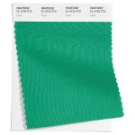
        • Classic Green 16-6340
        • Peach Pink 15-1530
        • Tangelo 15-1335
        • Summer Song 14-4316
        • Love Bird 13-0443

        Spring 2023 extra colours from LFW

        In the main the colours are repeated at London Fashion Week, albeit in lighter shades of yellow, red, orange and pale blue. However the emphasis shifts from the pink of New York Fashion Week to purple at London Fashion Week in the shape of Spring Crocus. The blues of LFW are also much more vibrant than those at NYW with Electric Blue Lemonade.

        Here are the colours from LFW to round off the colours for Spring 2023:

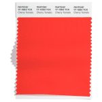
        • Cherry Tomato 17-1563
        • Persimmon 16-1544
        • Iced Mango 14-1140
        • Blazing Yellow 12-0643
        • Titanite 16-0229
        • Andean Toucan 16-6230
        • Airy Blue 14-4122
        • Electric Blue Lemonade 18-4245
        • Spring Crocus 17-3020
        • Pink Cosmos 16-2122


        Neutral classics

        Pantone® have also updated the Classic Colour Palette. These are a group of neutrals that are core basics in the form of a coffee, khaki green, light grey, cream and blue. Perfect grounding colours and perfect peaceful additional colours for weddings. 

        The bonus classic neutral colours for Spring 2023 are: 

        • Macchiato 17-1221
        • Leek Green 15-0628
        • Gray Lilac 13-3804
        • Vanilla Cream 12-1009
        • Skylight 12-4604

        And at LFW these are:

        • Oyster Mushroom 13-4201
        • Grayed Jade 14-6011
        • Tender Peach 12-0912
        • Mocha Mousse 17-1230
        • Bluing 19-3954

        Colour themes

        Colour plays an important part in our lives and it’ll be interesting to see how these colours filter through to influence things around us.

        Pantone® is the world-renowned authority on colour and the Pantone® Color of the Year is always really influential in any popular colour themes in fashion, interior design and weddings.

        Look out for my report when the 2023 colour of the year is released later in the year. My guess is for a bright green of Love Bird – we haven’t had a green since 2017 so feels fitting. And definitely a colour the Queen would have worn.  

        “We should take comfort that while we may have more still to endure, better days will return. We will be without friends again. We will be with our families again. We will meet again.” Queen Elizabeth II 2020 

        Old Red

        Old Red

        Old Red

        My first boss had a red biro that he nicknamed ‘Old Red’.

        I learnt so much in my very first marketing job. I find myself reciting, referring to and returning back to his tried and tested mantras over and over again. The lessons are etched in my head forever.

        My training with him was a proper grounding in the foundations of good marketing – a broad introduction into the vast and wonderful elements of a great marketing toolkit.

        Old Red would appear to mark up my copy. At the time I feared Old Red – wondering if my copy would pass the test and get signed off without further edits or redrafting.

        Two pairs of eyes

        But now I completely see the benefits of what Old Red came to teach me.

        ‘Four eyes see more than two’ became one such mantra because sometimes you become so close to a piece of work that you can’t see any obvious flaws in it. It’s always useful to get someone to check over your work for any mistakes or to make suggestions for improvements.

        One of my first jobs was to design our Yellow Pages adverts – this was back in the day of print advertising. There was no margin of error and once it was sent to print there was no going back. So it had to be perfect (unlike now, with the ability to edit websites and digital media).

        Proofreading 

        It was the best way to learn my craft. And watching the same boss throw any direct mail straight in the bin (without even opening it) if his name was not spelt correctly on the envelope, made me realise the importance of getting things right. Of making the best first impression. Of the power of language and words.

        So if you need a second pair of eyes to check over your existing copy, you can send it my way for editing and proofreading (where the legacy of Old Red lives on).

        My Nan’s old Olympia typewriter

        My Nan’s old Olympia typewriter

        Keyboard antics

        You may have spotted my Nan’s old Olympia typewriter featuring on posts recently. 

        My best memories of my grandparents ‘by the sea’ are of mealtime entertainment from the napkin people; keyboard antics on adding machines, pianos and typewriters; watching Nanny complete crosswords while Grandad rested his eyes; and I was convinced that my Nan was a special agent in another secret life.

        Greatest correspondent

        As well as this, my Nan was the greatest correspondent I’ve ever known. She would write regularly to a vast list of people whom she had acquired as great friends over the years. If you were in my Nan’s address book, then you had a place there for life.

        My Nan started my love of writing by sending old fashioned snail mail letters (I even got an award for correspondence whilst on a primary school residential trip!) 

        Her letter writing was legendary for many reasons, the first being the infamous colour of the stationery. The supply of trusty green envelopes lasted for decades, and they were easily distinguishable on my door mat, to the point when even my university house mates knew when a letter from my Nan had arrived. And she always helped me surpass the number of letters that any of my housemates received.

        Illegible handwriting

        The second reason her letters were memorable was because of her incredibly illegible handwriting. I could read and understand what she had written in her letters if she typed them on her trusty typewriter (or if she was kind enough to use block capitals). But it was a real rite of passage, which required code breaking skills, when I began receiving letters in her unique scrawl. It looked like she’d written it in shorthand. It was just a combination of lines and dots randomly placed in a line. With (a lot of) practice over the years, I could at least get the gist of her letters.

        Lastly, she always thoughtfully included newspaper articles and things that she knew would be of interest and use to me. She could’ve easily got a job as a press clippings collector! She wrote to me every week, so my letter box has certainly suffered from the decidedly decreased number of letters since her passing.

        I loved hearing her typewriter clatter away when I visited. I loved playing on the typewriter myself as a child. I was so thrilled when I was allowed to actually type on it when I was younger. The feel of the keys and how much force was needed for them to strike; the wonderful carriage return; the actual lock button for caps lock; and the magical slider to change the colour used on the ribbon.

        Heirlooms

        I was honoured to inherit my Nan’s typewriter (and her upright piano – but that’s another story) and it takes pride of place on a bookshelf in our living room.

        Nanny was always so dedicated to everything that she put her mind to, and this has rubbed off on me. Her unfailing support, encouragement and pride were an inspiration. My achievements are surely a demonstration of this upbringing. I admired her intelligence, loyalty and devotion and still sorely miss her.

        But her words on those green bits of paper live on in the lovely stack of letters that she sent to me.

        Eulogy writing

        Let me know if you need help putting into words your thoughts for those hard to write occasions – what better way to pay tribute to your loved ones than with a beautifully crafted eulogy.

        wonderful wedding wares

        Top Autumn 2022 colours from Pantone®

        Top Autumn 2022 colours from Pantone®

        Change of season

        It’s coming up to the Spring equinox this weekend and it definitely feels like the seasons are shifting with the very welcome return of sunnier weather and longer days.
        I feel like I’ve lost a whole month – February was a complete right off for me. So it’s quite a shock to be in March already!

        With the change in season, comes the start of the ‘social season’ in spring and summer when it was traditional for members of the upper class to change their residence (from their country houses to London) in order to attend events of the season.

        These events include Cheltenham Festival (March), the Grand National (April), The Boat Race (April), Badminton Horse Trials (May), Chelsea Flower Show (May), Epsom Derby (June), Royal Ascot (June), Cricket test matches at Lord’s (July), Wimbledon (July), Henley Royal Regatta (July), Edinburgh International Festival (August) , Cowes week (August), the Proms (July-September) and ending with Goodwood Revival (September).

        Historically the ‘London season’ events would’ve coincided with political business in the city and conclude when the elite would return to their country homes for the beginning of the shooting season on 12th August.

        Autumn 2022 colours

        Whilst we enter the beautiful and hopeful season of Spring, my thoughts drift to the cooler months at the end of the year with the recent fashion weeks in New York, London and Milan last month, then Paris earlier this month. It was good to see them back to being in person again this year (although only via invite only this time).

        From these fashion weeks, Pantone® have predicted 10 colours that they think will be prevalent in Autumn/Winter 2022/23.

        Fiery

        There are some really bright and bold colours to make a statement this autumn that are reminiscent of a roaring fire on Guy Fawkes night. Or for me, they evoke memories of the recent Winter Olympics and Paralympic Games held in Beijing. The fiery red (Lava Falls) feels similar to the Chinese flag and the Orange Tiger provides a nod to the Year of the Tiger which was marked recently for Chinese New Year.

        Polar

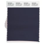
        I’ve loved watching all the winter sports coverage and a number of the colours conjure up images of cold winters on the piste (or equally on a dark polar night) such as an icy turquoise (Watersprout), a pale pink (Nosegay) and the dark navy blue night sky of Midnight.

        Rainforest

        Lastly, there is a real grounding of some earthy, natural colours that would be happily found in a luscious rainforest including greens of Amazon and Martini, along with a rich brown (Caramel).

        Fall 2022 colours 

        The top ten colours for Fall 2022 from New York Fashion Week are:
        • Pantone 18-1552 Lava Falls
        • Pantone 14-0852 Samoan Sun
        • Pantone 16-1358 Orange Tiger
        • Pantone 17-2624 Rose Violet
        • Pantone 18-6024 Amazon
        • Pantone 14-2806 Nosegay
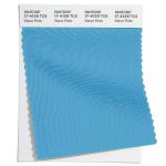
        • Pantone 14-4618 Waterspout
        • Pantone 18-1148 Caramel Café
        • Pantone 19-4127 Midnight
        • Pantone 18-0625 Martini Olive 

        Fall 2022 extra colours from LFW

        They may have different names but in the main the colours are repeated at London Fashion Week, with Watersprout apparent at both. There was one additional colour (instead of the bright pink from NYFW) to round off the colours for Fall 2022 in the form of the purple of Meadow Violet (similar to the current colour of the year, Very Peri).

        Neutral classics

        Pantone® have also created a Fall 2022 Classic Colour Palette. These are a group of neutrals that are core basics in the form of white, cream, dark and light grey, plus khaki green.

        The bonus classic neutral colours for Fall 2022 are:

        • Pantone 12-0602 Arctic Wolf
        • Pantone 12-0813 Autumn Blonde
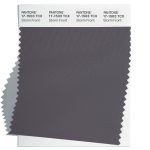
        • Pantone 19-4105 Polar Night
        • Pantone 17-0210 Loden Frost
        • Pantone 16-3917 Chiseled Stone

          Colour themes

          Colour plays an important part in our lives and it’ll be interesting to see how these colours filter through to influence things around us.

          Pantone® is the world-renowned authority on colour and the Pantone® Color of the Year is always really influential in any popular colour themes in fashion, interior design and weddings.

          Pantone® announce the Color of the Year 2022

          Pantone® announce the Color of the Year 2022

          Pantone® Colour of the Year 2022

          Aside from the obvious big occasion on the horizon, the other thing I look forward to in December is the announcement of the Pantone® colour of the year.

          I must admit, I was expecting a light and airy colour – perhaps a pale pink that would act like a breath of fresh air, so I had plumped for a gossamer pale pink.

          Very Peri 17-3938 

          Instead, Pantone® have announced that Very Peri will be the colour of the year for 2022, a lavender purple colour.

          It’s not that long since another purple (in the form of Ultra Violet) took the top spot in 2018. And purple is no stranger to the colour of the year with Radiant Orchid in 2014 and Blue Iris from 2008.

          A bit of a happy, unexpected surprise as this colour doesn’t appear in any of their seasonal predictions. Instead they’ve created a brand new colour combining a cool blue and vibrant red. And purple just happens to be one of my favourite (and company brand) colours!

          Spring 2022 predictions

          Aside from two grey colours in the neutral section, the colour predicitons from New York and London fashion weeks differed greatly which made it hard to see a clear winner for colour of the year for 2022.

          Pantone® are certainly not afraid of breaking or even making the rules. In the past, they’ve picked not one, but two colours such as this year (with Illuminating and Ultimate Gray in 2021) as well as in 2016 with Rose Quartz and Serenity.

          So they are perfectly within their rights to just create a brand new colour if the right shade isn’t already in their catalogue of colours.

          “It was really important for us to come up with a new color, because we have a very new vision of the world now,” said Pantone® Color Institute’s Executive Director Leatrice Eiseman.

          Merging and emerging

          Very Peri, has been described by colour company Pantone® as “a periwinkle shade of blue”. Leatrice Eiseman, executive director of Pantone® Color Institute said that the Colour of the Year for 2022 encompasses “the qualities of the blues, yet at the same time possesses a violet-red undertone. Pantone® 17-3938 Very Peri displays a spritely, joyous attitude and dynamic presence that encourages courageous creativity and imaginative expression.”

          “Pantone® 17-3938 Very Peri is a symbol of the global zeitgeist of the moment and the transition we are going through,” the brand explained. “As we emerge from an intense period of isolation, our notions and standards are changing, and our physical and digital lives have merged in new ways.”

          I’m surprised at myself that I wished for a pastel colour. But maybe we need something comforting, rich and warm like a heavy velvet blanket right now to see us through the winter and into 2022.

          #COY2022

          wonderful wedding wares