Top Fall 2020 colours from Pantone® for autumn weddings


Autumn 2020 colours
After what seemed like the slowest and longest starts to the year, February now seems to be zipping away. And the blossom buds on the trees remind us that spring is just around the corner.
But I’m already thinking about forthcoming seasons later in the year, as Pantone® have announced the colours for the autumn and winter months of 2020/21.
With fashion weeks just kicking off in New York yesterday (before moving on to London on Valentine’s Day, Milan on the 18th and Paris on the 24th), Pantone® have predicted 10 colours that they think will be prevalent in Fall/Winter 2020/21. And it’ll be great to see these colours appearing in autumn weddings this year.
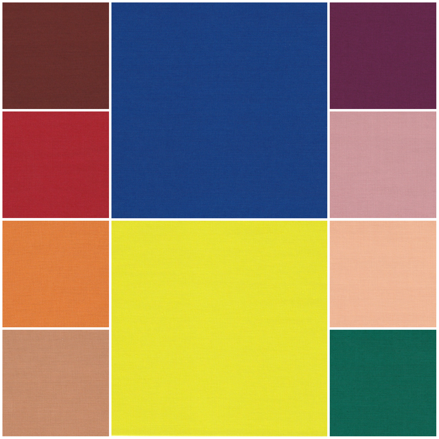
It’s no surprise to see half of the colours in earthy and typically autumnal colours. They are also joined by some rich jewel colours, some dusty pastel colours and a pop of statement neon.
Greatest hits of colours
This line up feels a bit like the greatest hits tour for Pantone®, covering all their number one hits in the form of previous colours of the year (such as a peach for Living Coral from 2019, a purple for Ultra Violet of 2018, a strong green for Greenery in 2017, a pastel pink for 2016 and of course Classic Blue, the current 2020 colour of the year). And then there’s a new unheard of song that none of the fans know all the words to yet and don’t quite know what to make of it.
Pantone® Color Institute executive director Leatrice Eiseman wants consumers ‘to feel at ease with a spectrum of colors’ and this season offers ‘traditional tones and surprising ones that offer plenty of room for experimentation.’
Potter’s wheel
Fitting with the current more sustainable ‘make, do and mend’ way of life, our nation’s obsession has gone from baking, sewing and now to pottery. (I can’t get enough of the Great Pottery Throw Down at the moment especially when the judge gets so emotional over the makes the potters produce).
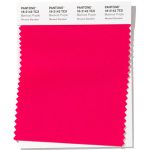
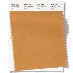
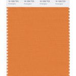
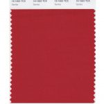
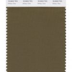
So the earthy palette of the Fall 2020 colours reminds me of the range of clay colours you’d find in a pottery. With the brown Fired Brick and Sandstone being placed in the hot orange and red fire of Amberglow and Samba.
90s inspired neon
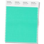
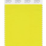
I’m pleased to see the pop of the neon Green Sheen appearing amongst the colours. Neon signage, perhaps with a personalised pun, is popular at the moment as wedding décor, along with a nostalgic nineties injection of vibrant colour.
Lots of nineties babies are tying the knot. So nods to the nineties will be found in holographic stationery, glow in the dark elements, as well as lace seeing a revival.
And it’s all about unique lighting with vintage lampshades, statement chandeliers and 90s inspired neon.
Rich jewels
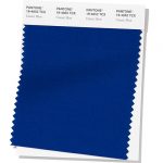
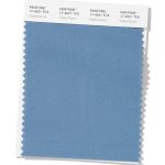
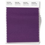
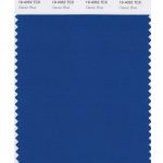
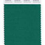
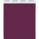
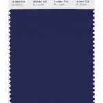
The inclusion of some rich colours in the mix are almost tactile and velvety. Ultramarine Green, Magenta Purple and the colour of the year, Classic Blue, almost feel regal and would be very fitting for a medieval banquet style wedding.
Muted pastels
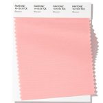
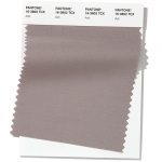
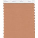
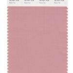
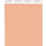
In addition, the subtle Rose Tan and Peach Nougat are lovely transitional pastel colours to lead us in to spring next year.
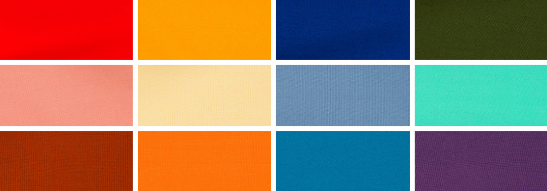
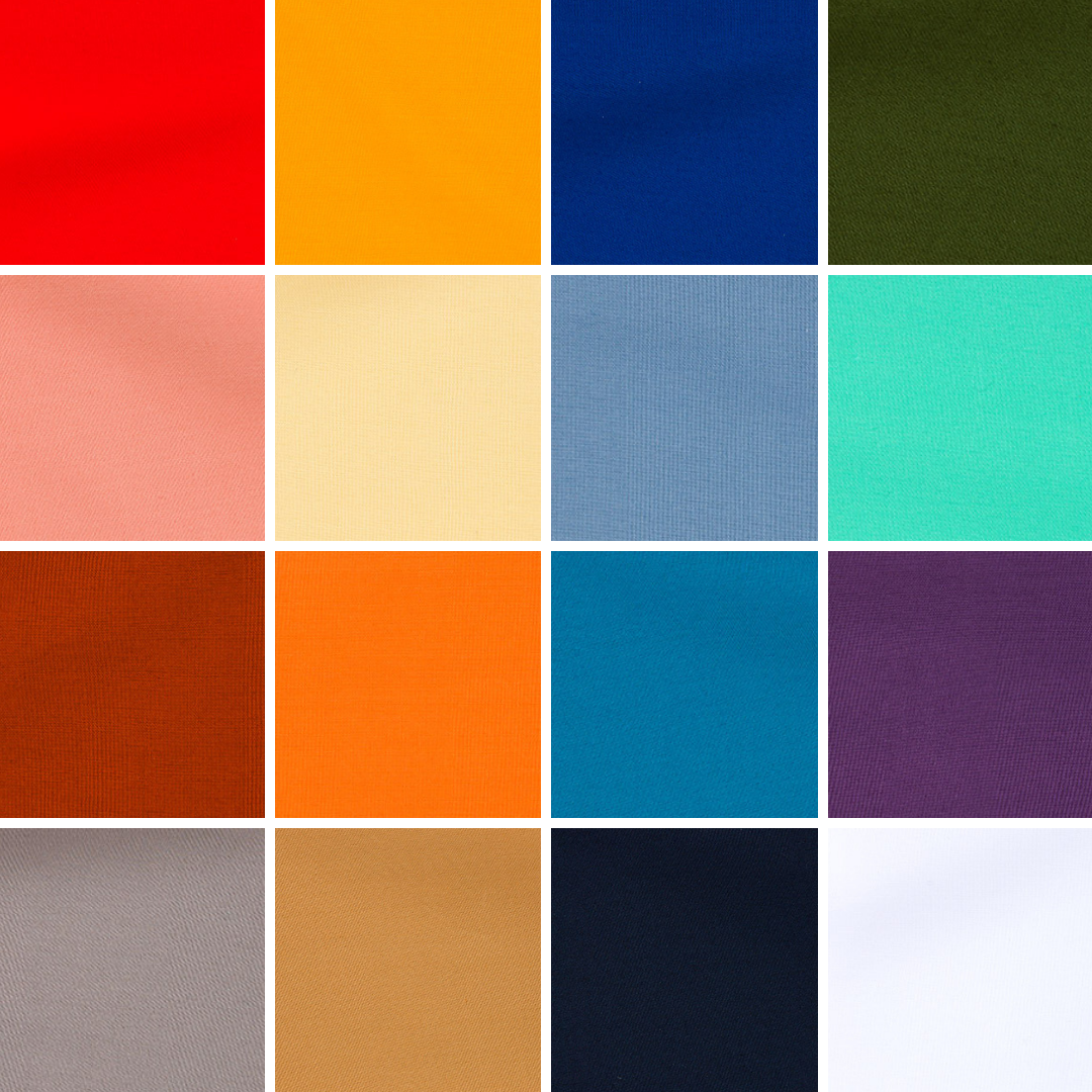
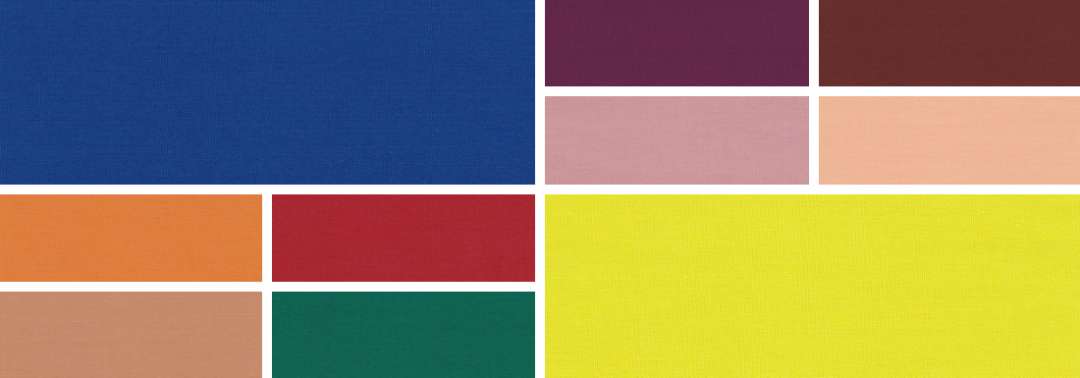
Fall 2020 colours
The top ten colours for Autumn/Winter 20/21 are:
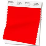
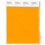
- Amberglow PANTONE 16-1350
- Samba PANTONE 19-1662
- Sandstone PANTONE 16-1328
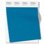
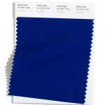
- Classic Blue PANTONE 19-4052
- Green Sheen PANTONE 13-0648
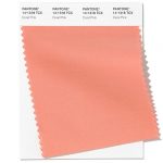
- Rose Tan PANTONE 16-1511
- Ultramarine Green PANTONE 18-5338
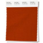
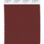
- Fired Brick PANTONE 19-1337
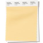
- Peach Nougat PANTONE 14-1220
- Magenta Purple PANTONE 19-2428
Neutral basics
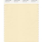
- Almond Oil PANTONE 12-0713
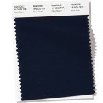
- Blue Depths PANTONE 19-3940
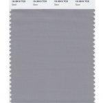
- Sleet PANTONE 16-3916
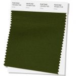
- Military Olive PANTONE 19-0622
-
Fall 2020 extra colours from LFW
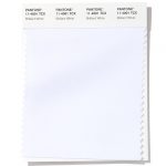
They may have different names but in the main the colours are repeated at London Fashion Week, along with a couple of additional colours (instead of the pastel pink and purple colours) to round off the colours for Fall 2020. There’s also a bit of a rejig of whether some colours sit in the neutrals or the main set (as Military Olive gets promoted at LFW) along with a purer white in the neutral basics. Here are the extra red, white and blue shades:
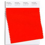
- Mandarin Red PANTONE 17-1562
- True Blue PANTONE 19-4057
- Jet Stream PANTONE 11-0605
Colour themes
It’ll be great to see how couples incorporate these colours in to their weddings later this year. I can see how the classic neutrals will play a big part in coupling up with some of the more vibrant choices.
Pantone® is the world-renowned authority on colour and the Pantone® Color of the Year is always really influential in any popular colour themes in fashion, interior design and weddings.
See some of my wedding styling trends for weddings in 2020.
sign up to receive the latest posts straight to your inbox
wonderful wedding wares


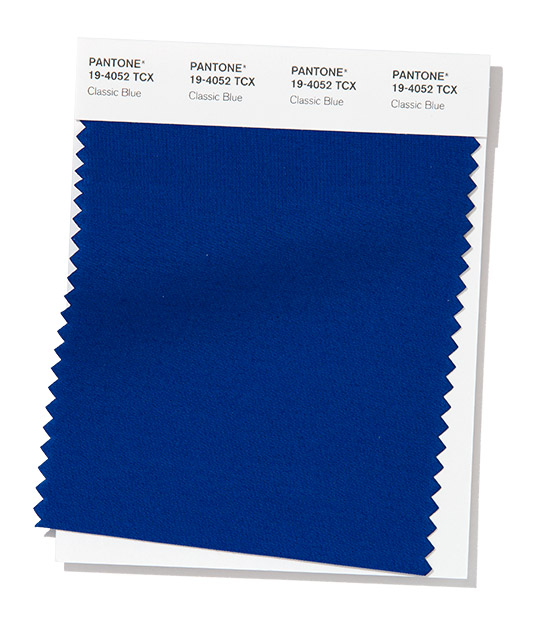 Classic Blue