by Hanami Dream | 3, December, 2015 | blog, trends
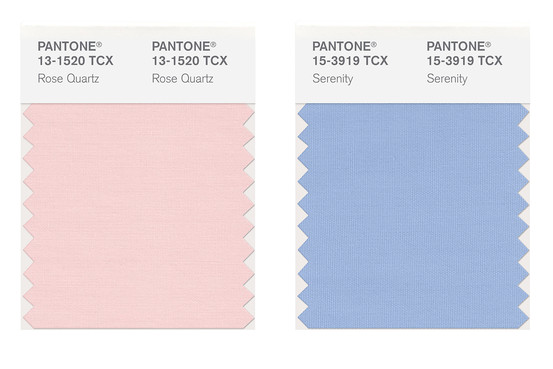
The Pantone® Color of the Year 2016 is Rose Quartz AND Serenity. Yes, we get two colours for the price of one next year. It’s the first time Pantone® have ever announced two colours and a long time since a pastel colour has hit the top spot. They are a nice calm change to the recent bold jewel colours of the last ten years. We can already see these colours featuring singly in couples’ colour schemes and look forward to seeing people using them in tandem too.
Pantone® is the world-renowned authority on colour and the Pantone® Color of the Year is always really influential in any popular colour themes in fashion, interior design and weddings.
Our guess for the Color of the Year 2016 was for Peach Echo, Buttercup or a great neutral colour like Iced Coffee. However we we didn’t see two colours coming! Nor a pastel colour. What we have got is something more relaxing and more choice.

by Hanami Dream | 25, October, 2015 | news
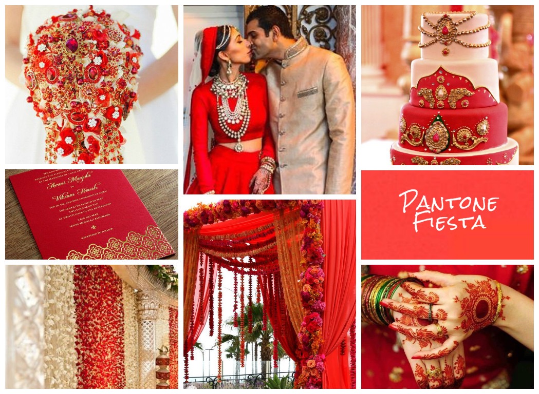
Very proud to have won the fiesta mood board in the recent UKAWEP spring/summer Pantone® competition.
Sara from Burnett’s Boards, picked the winners for each colour and shared her thoughts on her blog today – http://burnettsboards.com/2015/10/wedding-event-institute-pantone-contest/
Many thanks to Burnett’s Boards for their kind words:
“Fiesta is bold, bright, exciting, and a total party color, which is why Nicola Jackson’s energetically red mood board was the winner for me. Indian weddings are big, colorful, (often) week-long events with a multitude of parties and red is a beautiful color for that amount of enthusiasm. Plus look at that cake – it’s fit for a queen!”
by Hanami Dream | 19, October, 2015 | news
Really proud to have won the UK Academy of Wedding and Event Planning’s fiesta SS16 Pantone® mood board competition.
http://www.weddingacademylive.com/2015/10/19/and-the-winners-are/

Image Credits (clockwise from top left)
arzimasks.com
best-restaurants-in-marrakech.com
capitalator.com
cyclehousefamily.com
dowdingshop.com
esubstation.com
fitnessfoodonline.com
furnitureskart.com
indosiang.com
listingtrips.com
by Hanami Dream | 29, September, 2015 | blog, trends

At this time of year Spring seems a long way off – we’ve just entered the Autumn Equinox, the leaves are changing colour, nights are drawing in and the mornings are bitterly cold (thankfully we’ve had some lovely sunny days though!).
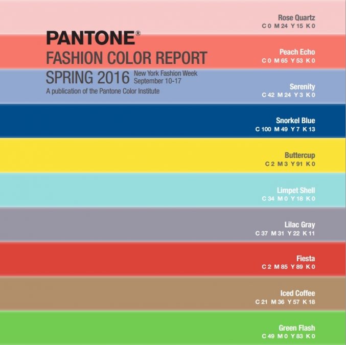
However those lovely folks at Pantone® have just announced their colour report for Spring 2016, released to coincide with New York Fashion Week. And this palette of ten fresh and vibrant colours gives us hope for the Spring time when everything will come back to life again.
The colours seem full of sunshine and are really vibrant rather than just subtle pastels. There seems a real cohesion and they blend together in harmony. There’s not a colour that jars amongst them and we can already imagine some nifty colour partnerships amongst them.
We love the combination of the navy Snorkel Blue, yellow Buttercup and aqua Limpet Shell which transports us right to a tropical beach in the summer time – representing the sky, sand and sea respectively. Which is just the desired outcome by the Pantone Color Institute™ who say that ‘Colors this season transport us to a happier, sunnier place where we feel free to express a wittier version of our real selves.’
These colours are intended to be calming, soothing, relaxing and have a sense of escapism. This is a chilled out vacation in Cuba with days spent relaxing by the sea and nights full of fiestas.
The top ten colours for Spring 2016 are:
- PANTONE 13-1520 Rose Quartz
- PANTONE 16-1548 Peach Echo
- PANTONE 15-3919 Serenity
- PANTONE 19-4049 Snorkel Blue
- PANTONE 12-0752 Buttercup
- PANTONE 13-4810 Limpet Shell
- PANTONE 16-3905 Lilac Gray
- PANTONE 17-1564 Fiesta
- PANTONE 15-1040 Iced Coffee
- PANTONE 15-0146 Green Flash
Pantone® is the world-renowned authority on colour and the Pantone® Color of the Year is always really influential in any popular colour themes in fashion, interior design and weddings.
We wait with baited breath for the release of the 2016 news. Could it be the turn of an orange colour to be the Color of the Year such as Peach Echo? Or perhaps a strong neutral like Iced Coffee that will blend with Spring as well as Fall colours? Or our particular favourite is Buttercup. Let’s wait for December to find out!
by Hanami Dream | 13, February, 2015 | blog, trends
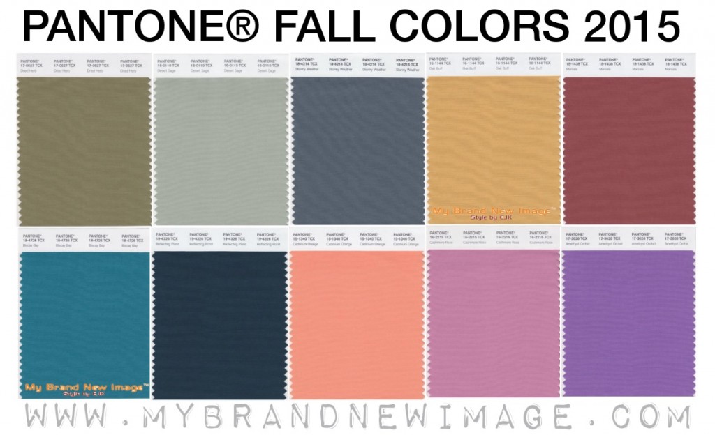
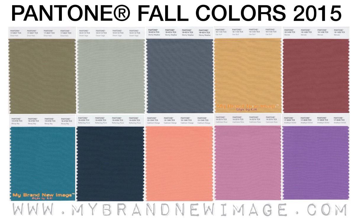
Released to coincide with New York Fashion Week, Pantone® have announced their colour report for Fall 2015. Titled ‘Evolving Color Landscape’, this autumn’s colours are a nice mix of earthy neutrals with some statement pops of colour.
- Dried Herb
- Desert Sage
- Stormy Weather
- Oak Buff
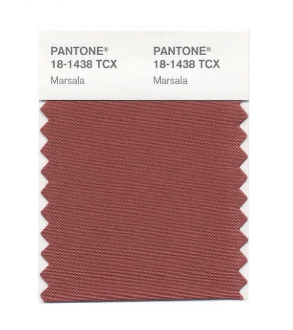
- Marsala
- Biscay Bay
- Reflecting Pond
- Cadmium Orange
- Cashmere Rose
- Amethyst Orchid
Pantone® is the world-renowned authority on colour and the Pantone® Color of the Year is always really influential in any popular colour themes in fashion, interior design and weddings.
For us, Marsala (the Pantone® Color of the Year 2015) sits much better with these earthy tones than the pastels of Spring 2015. It looks like Marsala is totally at home with these natural colours, complimenting but standing out proudly.
We also love the rich teal colour of Biscay Bay and can’t wait to see it and these autumnal colours featuring in couples’ colour schemes.
See some of our trend predictions for weddings in 2015.