Select Page
Pantone® announce the Color of the Year 2024

Pantone® announce the Color of the Year 2024

Pantone® Colour of the Year 2024

As always, December is bonkers busy with the build up to Christmas getting earlier and earlier each year, along with all the school events and several birthdays to navigate before we can collapse in a big (usually ill) heap at the end of the year!

Meanwhile, there is also the exciting news of the Pantone® colour of the year. And 2024 is a special year as it marks 25 years of this momentous trend movement.

Recently, when the Spring 2024 colours were published, my guess for the colour of the year was for a bold sunny orange (as we haven’t had an orange since 2012). Now whilst this week’s announcement is for a slightly more pastel version, I’m claiming that my prediction for an orange tone was pretty near the mark.

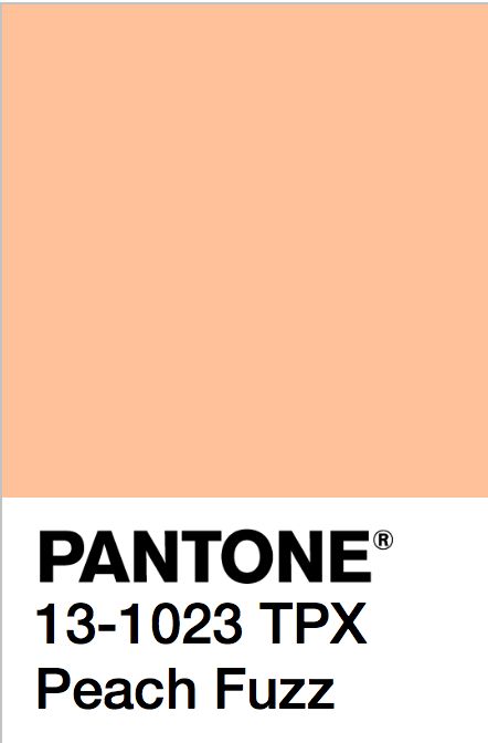
Peach Fuzz 13-1023

Pantone® have announced that Pantone® 13-1023 Peach Fuzz is the colour of the year for 2024, somewhere between a pale pink and orange colour.

Peach Fuzz has been described by Pantone® as “a gentle and nurturing peach shade that serves as a reminder to slow down and care for ourselves and one another. The romantic color’s name reflects the tactile sensuality associated with the hue: velvety peaches, soft marabou feathers, and smooth vintage satins and silks all come to mind when thinking about the pink and orange combo.”

The Pantone Color Institute’s executive director Leatrice Eiseman points out that the “delicate shade summons viewers to the human experience, with an emphasis on the importance of health and wellness for mind, body, and soul. From the warm colors of a sunrise or sunset to the coziness of a fuzzy blanket, the color affirms moments of internal tranquillity with the deep need for community, gathering, and connection.”
25 years of Pantone®

Orange is no stranger to being the colour of the year with a bright shade of Living Coral in 2019, a deeper Tangerine Tango in 2012, a pale Sand Dollar in 2006, plus Tiger Lily back in 2004.

There have also been some sunny yellows over the years in the form of Illuminating in 2021 and Mimosa in 2009.

Spring 2024 predictions

Once again, this colour doesn’t appear exactly in any of their seasonal predictions, although there were a number of yellow and orange sunset colours at both New York and London Fashion Weeks including Rooibos Tea, Orangeade, Lemon Drop, Spicy Mustard, Sun Orange, Fiesta and Charlock.

Protection

What does the name of the colour of the year mean? Well, there are over 300 varieties of peaches. And the fruit is deemed very important in Chinese culture as it can symbolise fertility and long life. The fuzz on peaches is actually a form of protection as it repels excess water away from the skin to stop it rotting prematurely. Additionally the fuzzy texture keeps insects away to stop them from destroying the fruit.

Cheeky

Peach Fuzz wouldn’t be out of place as the name for a cooling peach schnapps drink over a glassful of ice. Likewise, the peach emoji can also signify another way of saying ‘bottom’ on social media. And sometimes it can refer to the soft fine unwanted hair on cheeks.

Blush tones

But to me, this colour of the year for 2024 feels soft, romantic and peaceful. A beautiful warm sunset over clouds. It appears as lights as a feather, like a stick of candy floss at the beach or a full puffball netting skirt billowing in the wind.

Peaches and cream

There are so many wonderful sayings with the word ‘peach’ in them which usually mean something good about life. The expression has come to mean something which is particularly good or sweet, such as ‘Everything is peachy!’

Looks like Peach Fuzz will bring a relaxing and peaceful vibe for 2024 – with a touch of cheekiness!

#COY2024

Pantone® announce the Color of the Year 2023

Pantone® announce the Color of the Year 2023

Pantone® Colour of the Year 2023

December is a super busy month in our household, with all the obvious build up to Christmas and all that entails (like several Christmas concerts today) but it is also birthday for two of my children!

In amongst all that craziness, is the excitement of the announcement of the Pantone® colour of the year.

Back when the Spring colours were published during the fashion weeks in September, my guess was for a bright green like Love Bird to be the colour of the year for 2023. After all we haven’t had a green since 2017.

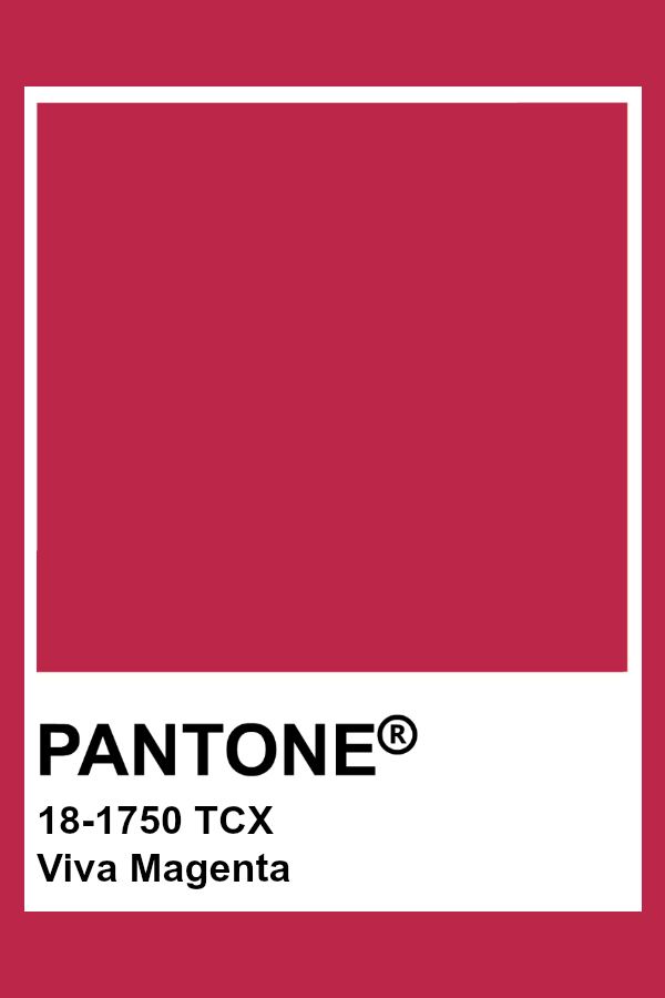
Viva Magenta 18-1750

Instead, Pantone® have announced that Pantone® 18-1750 Viva Magenta will be the colour of the year for 2023, a bold raspberry pink colour. Ironically, on the day it was announced that was also the colour that my nails were painted. Maybe I subliminally knew anyway!

It feels like an evolution from the calming, Classic Blue of 2020, to the vibrant Very Peri purple of 2022, and now a vivacious bright red/pink colour for 2023.

Pink is no stranger to the colour of the year with a pale pink of Rose Quartz in 2016, and two more daring pinks as Honeysuckle in 2011 and Fuchsia Rose in 2001.

There have also been no shortage of red shades to boost our confidence over the years in the form of Marsala in 2015, Chilli Pepper in 2007 and True Red in 2002.

Spring 2023 predictions

Once again, this exact colour doesn’t appear in any of their seasonal predictions, although there were a number of bright red, purple and pink colours at both New York and London Fashion Weeks (including Beetroot Purple 18-2143).

Full of life

Viva Magenta has been described by colour company Pantone® as “a shade rooted in nature descending from the red family and expressive of a new signal of strength”. Leatrice Eiseman, executive director of Pantone® Color Institute said that the Colour of the Year for 2023 “vibrates with vim and vigor. Viva Magenta is brave and fearless, and a pulsating color whose exuberance promotes a joyous and optimistic celebration, writing a new narrative.”


“Pantone’s Color of the Year, Viva Magenta 18-1750 is powerful and empowering. It is a new animated red that revels in pure joy, encouraging experimentation and self-expression without restraint, an electrifying, and a boundaryless shade that is manifesting as a stand-out statement. Viva Magenta welcomes anyone and everyone with the same verve for life and rebellious spirit. It is a color that is audacious, full of wit and inclusive of all.”


“Viva Magenta descends from the red family, and is inspired by the red of cochineal, one of the most precious dyes belonging to the natural dye family as well as one of the strongest and brightest the world has known.”

At this time of the year, I’d be quite happy to hibernate and hide away but maybe it is time for a renewed vitality and to get back out there and enjoy life again. Looks like Viva Magenta will give us the much needed boost of energy for 2023.

#COY2023

Pantone® announce the Color of the Year 2022

Pantone® announce the Color of the Year 2022

Pantone® Colour of the Year 2022

Aside from the obvious big occasion on the horizon, the other thing I look forward to in December is the announcement of the Pantone® colour of the year.

I must admit, I was expecting a light and airy colour – perhaps a pale pink that would act like a breath of fresh air, so I had plumped for a gossamer pale pink.

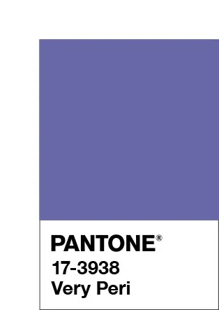
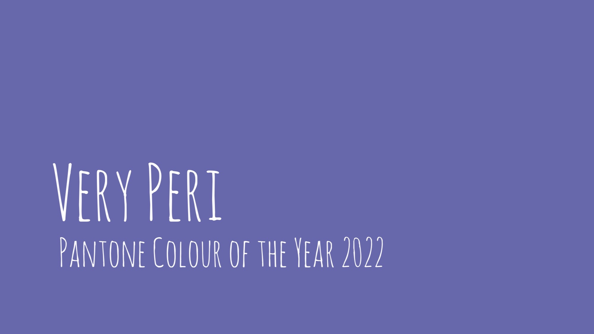
Very Peri 17-3938 

Instead, Pantone® have announced that Very Peri will be the colour of the year for 2022, a lavender purple colour.

It’s not that long since another purple (in the form of Ultra Violet) took the top spot in 2018. And purple is no stranger to the colour of the year with Radiant Orchid in 2014 and Blue Iris from 2008.

A bit of a happy, unexpected surprise as this colour doesn’t appear in any of their seasonal predictions. Instead they’ve created a brand new colour combining a cool blue and vibrant red. And purple just happens to be one of my favourite (and company brand) colours!

Spring 2022 predictions

Aside from two grey colours in the neutral section, the colour predicitons from New York and London fashion weeks differed greatly which made it hard to see a clear winner for colour of the year for 2022.

Pantone® are certainly not afraid of breaking or even making the rules. In the past, they’ve picked not one, but two colours such as this year (with Illuminating and Ultimate Gray in 2021) as well as in 2016 with Rose Quartz and Serenity.

So they are perfectly within their rights to just create a brand new colour if the right shade isn’t already in their catalogue of colours.

“It was really important for us to come up with a new color, because we have a very new vision of the world now,” said Pantone® Color Institute’s Executive Director Leatrice Eiseman.

Merging and emerging

Very Peri, has been described by colour company Pantone® as “a periwinkle shade of blue”. Leatrice Eiseman, executive director of Pantone® Color Institute said that the Colour of the Year for 2022 encompasses “the qualities of the blues, yet at the same time possesses a violet-red undertone. Pantone® 17-3938 Very Peri displays a spritely, joyous attitude and dynamic presence that encourages courageous creativity and imaginative expression.”

“Pantone® 17-3938 Very Peri is a symbol of the global zeitgeist of the moment and the transition we are going through,” the brand explained. “As we emerge from an intense period of isolation, our notions and standards are changing, and our physical and digital lives have merged in new ways.”

I’m surprised at myself that I wished for a pastel colour. But maybe we need something comforting, rich and warm like a heavy velvet blanket right now to see us through the winter and into 2022.

#COY2022

wonderful wedding wares

Pantone® announce the Color of the Year 2021

Pantone® announce the Color of the Year 2021

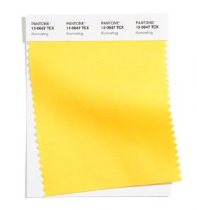
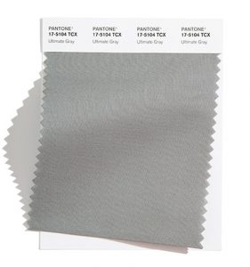
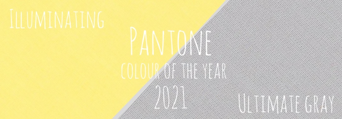
Pantone® have picked not one but two colours of the year for 2021. It’s only the second time they’ve picked more than one colour (since 2016 when it was Rose Quartz and Serenity).

The Pantone® Color of the Year 2021 is Illuminating 13-0647 AND Ultimate Gray 17-5104.

I’m over the moon that my top tip for the colour of the year has hit the mark (take a look at my review of the Spring/Summer 2020 colours) although a little disappointed that Illuminating wasn’t strong enough to be one colour on it’s own.

However, I think that the bright and fresh yellow of Illuminating is the ray of sunshine that we need after 2020. A spark of warm hope. Whilst the neutral grey provides stability and a reassuring foundation.

Sunshine on a rainy day.

I look forward to seeing couples incorporating Illuminating and Ultimate Gray into their wedding colour schemes in 2021.

#COY2021


sign up to receive the latest posts straight to your inbox

wonderful wedding wares

Pantone® announce the Color of the Year 2020

Pantone® announce the Color of the Year 2020

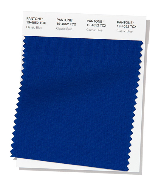
Pantone® have picked a soothing and refreshing blue as their colour of the year for 2020. Don’t feel blue! You’ve got ‘Classic Blue’ to get you through the first year of the new decade.

Classic Blue

Funnily enough blue was my hot tip for the Pantone Colour of the year in 2020 – take a look at my review of the Spring/Summer 2020 colours. And Classic Blue sits perfectly in the beautiful seascape of colours to embrace next year.

As Pantone® Vice President Laurie Pressman said, it is “a timeless and enduring blue hue, timeless in its simplicity … Classic Blue is calming and confident. It mixes well with shades across the color spectrum and serves as an anchor on its own.”

It is “a reassuring presence instilling calm, confidence and connection”. … “It is this kind of constancy and confidence that is expressed by Classic Blue, a solid and dependable blue hue we can always rely on.”

Calming influence

The emphasis on a bold primary colour feels like a big back to basics statement and a strong, emotive and versatile colour.

Classic Blue (also known as Pantone® 19-4052) feels like a good palette cleansing colour after the vibrancy of Living Coral in 2019. Perhaps a safe choice, hopefully not political but beautifully calming in a sea of constant change and uncertainty at the moment.

It is natural, neutral and nautical.

2020 weddings

Classic Blue is exactly what it says on the tin. Classic. A core basic colour and a stylish accompaniment to any vibrant pop of colour. I look forward to seeing couples incorporating Classic Blue into their wedding colour schemes in 2020.

#COY2020

Sign up to receive the latest wedding planning tips, tools, trends and traditions straight to your inbox.

sign up to receive the latest posts straight to your inbox

wonderful wedding wares

Pantone® announce the Color of the Year 2019

Pantone® announce the Color of the Year 2019

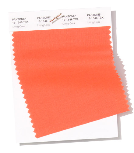
Pantone® have picked a warm and energising orange ‘Living Coral’ as their colour of the year for 2019!

Living Coral

For me, it was always going to be one of the warmer tones of either a bright yellow or vibrant red. This seems like the perfect compromise mix of the two, called Living Coral (also known as Pantone® 16-1546).

As Pantone® Vice President Laurie Pressman said, it is an “an animating and life-affirming coral hue with a golden undertone that energizes and enlivens with a softer edge. Sociable and spirited, the engaging nature of Living Coral…embodies our desire for playful expression”.

Pantone® is the world-renowned authority on colour and the Pantone® Color of the Year is always really influential in any popular colour themes in fashion, interior design and weddings. They have been picking a colour of the year for 20 years now, taking into account cultural trends, as well as “how colors can embody our collective experience and reflect what is taking place in our global culture at a moment in time,” according to the press release from Pantone®.

Eco friendly

It seems quite fitting that this should be the colour next year especially when there’s such a focus on our oceans, climate change and protecting our natural resources. Living Coral seems the perfect ambassador to remind us of these important factors and to consider how to make weddings more eco friendly.

Living Coral instantly conjurors up images of life under the clear blue sea and makes me reminisce about happy days learning to scuba dive at the Great Barrier Reef in Australia. It is an absolute underwater paradise, literally awash with colour energised by the sunshine. I still dream about a phenomenal night dive when I felt like I was flying over mountains and as I shone a torch over the coral it all came to life when the light touched it. It was breath taking. I learnt how important coral is in the marine life for providing habitats and shelter, protecting coast lines, and also filtering the water. It needs to be protected.

2019 weddings

The 2019 colour of the year certainly would be fitting for a beach wedding although would also pair seamlessly with a sophisticated navy, grey or burgundy to make it a relevant colour to fit a wedding at any time of year. And of course coral is associated with a couple’s 35th wedding anniversary so it’s no stranger to being a part of weddings.

I’ve been desperate for a yellow or an orange colour to get top billing for a couple of years and my guess for the Color of the Year 2019 was for Aspen Gold or Mango Mojito (see my Spring 2019 report). I’m pleased to see a vibrant, playful colour leading the way again in 2019 and can’t wait to see couples incorporating Living Coral into their wedding colour schemes.

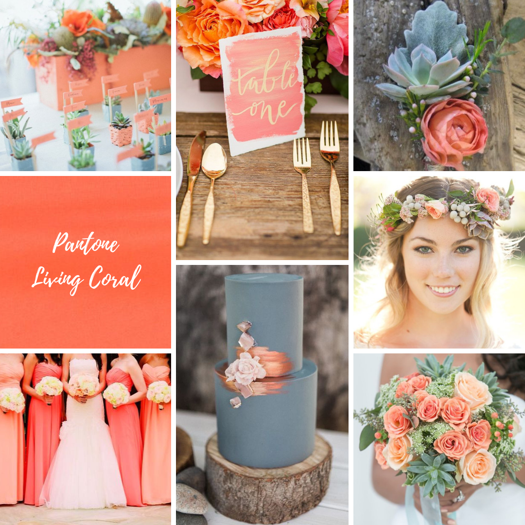
Living Coral wedding inspiration

See more about my Living Coral mood board from the UK Academy of Wedding and Event Planning’s SS19 Pantone® mood board competition from earlier this year.

#COY2019

Sign up to receive the latest wedding planning tips, tools, trends and traditions straight to your inbox.

sign up to receive the latest posts straight to your inbox

winner UK Blog Awards 2018

wonderful wedding wares

Living Coral in UKAWEP Pantone® colour trend challenge

Living Coral in UKAWEP Pantone® colour trend challenge

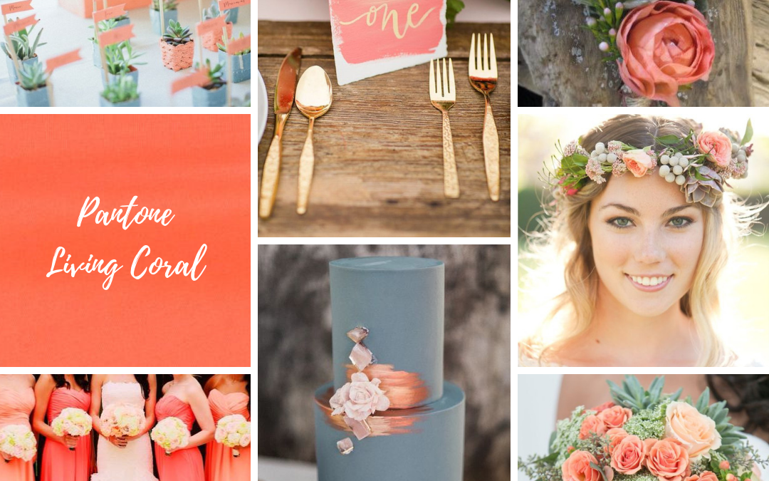
Here’s the Living Coral mood board that I submitted in the UK Academy of Wedding and Event Planning SS19 Pantone® colour trend challenge earlier this year.

Living Coral | succulents on the beach

IMAGE CREDITS:
Succulent place names | Abi Q via Ruffled Blog https://ruffledblog.com/galleries/southwestern-palm-springs-wedding/?pid=80626&fbclid=IwAR2vhNrhf3jfyRqoqbG13QckGlvPY-hImFrL2vBfC7pf-HLwRiiu4CNGVRM
Table setting | Katelyn James Photography http://katelynjames.com/ via Hey Wedding Lady https://heyweddinglady.com/jewel-toned-autumn-wedding-inspiration
Buttonhole | Katie Day Photography http://www.katiedayphotos.com/…/05/13/meet-brendan-and-nina/ via Chickabloom Floral Studio http://www.chickabloom.com/bright-fun-spring-bouquets/
Floral crown | Matt & Jentry Photographers via Le Magnifique http://www.lemagnifiqueblog.com/2013/05/much-ado-about-nothing-wedding.html?m=1&fbclid=IwAR19fmI3LRUi5VZU8b9pIUhSnznxiSNrIYerRIG8JSH8Kv1J_nrQKJ_AOaA
Bridesmaids | Aspen Willow https://www.aspenandwillow.com/
Cake | Wedtown via http://weddingcandlesideas.net/wedding-cakes-ideas/
Bouquet – AJ Shorter Photography http://www.ajshorter.com/ via Every Last Detail http://theeverylastdetail.com/modern-peach-mint-wedding-inspiration/?fbclid=IwAR3FfULJii2I-n1UzBtAfVXWyDmRZbum-tzTCQBbhdDHcFgNkNqbqCdQ23U


sign up to receive the latest posts straight to your inbox

winner UK Blog Awards 2018

wonderful wedding wares

#UKWedLunch – Wednesday 13th December 2017 – wedding trends

#UKWedLunch – Wednesday 13th December 2017 – wedding trends

#UKWedLunch – Wednesday 13th December 2017

As well as general wedding planning chat, today we are talking about 2018 wedding trends  #weddingplanning #UKWedLunch

2018 WEDDING TREND 1: Clothing – what do you think to the arm warmer style sleeves, trailing bows on shoulders or Watteau backs on wedding dresses? #UKWedLunch

2018 WEDDING TREND 2: Culture – do you think films like jungle book or aquaman will influence tropical  and underwater wedding themes next year? #UKWedLunch

2018 WEDDING TREND 3: Celebrities – will Harry and Meghan’s wedding influence some great British street party style weddings? #UKWedLunch

2018 WEDDING TREND 4: Colour and styling – how do you see the @pantone color of the year working in couples’ schemes? #UKWedLunch

2018 WEDDING TREND 5: Catering – will family style serving and buffets still be big news at weddings in 2018? #UKWedLunch

2018 WEDDING TREND 6: Current affairs – will the winter Olympic swimming or World Cup in Russia influence some wedding themes in 2018? #UKWedLunch

This week’s top tips were about 2018 wedding trends – see more at https://www.hanamidream.co.uk/category/trends/ #UKWedLunch

Thank you for all the RTs, follows and likes! Hope to see you again next Wednesday 1-2pm for more wedding planning chat #UKWedLunch

As well as general wedding planning chat, next week will be a wedding quiz #UKWedLunch

JOIN US EVERY WEDNESDAY! on Twitter between 1-2pm GMT

Pantone® announce the Color of the Year 2018

Pantone® announce the Color of the Year 2018

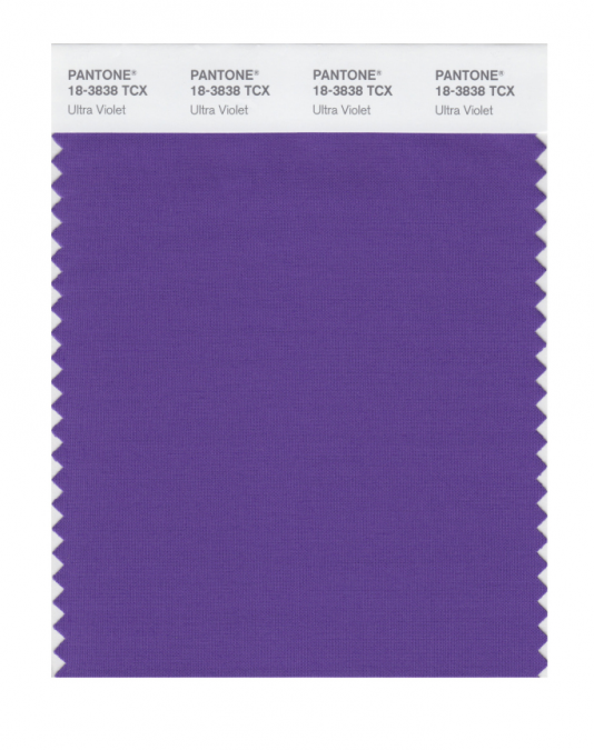
Pantone® have picked a deep purple ‘Ultra Violet’ as their colour of the year for 2018!

What a wonderful, vibrant colour that I can’t wait to see couples incorporating into their wedding colour schemes next year.

For me, it was always going to be a toss up between a bright yellow or a brilliant shade of purple. I’m over the moon that Pantone® have gone for such an attention grabbing and bold purple to be the colour of the year. It is a remarkable blue-toned shade of purple called Ultra Violet (also known as Pantone® 18-3838) and I’m pretty pleased as purple just happens to be my favourite colour!

As Pantone® Vice President Laurie Pressman said, it is an “optimistic and empowering color” for “originality, ingenuity, and visionary thinking”. It feels futuristic, magical and regally majestic – which is quite fitting for the year of another royal wedding in the UK.

Pantone® is the world-renowned authority on colour and the Pantone® Color of the Year is always really influential in any popular colour themes in fashion, interior design and weddings.

I’ve been desperate for a yellow or an orange colour to get top billing for a couple of years and my guess for the Color of the Year 2018 was for Meadowlark (see my Spring 2018 report). But I’m so pleased to see a vibrant, bright colour leading the way again in 2018.

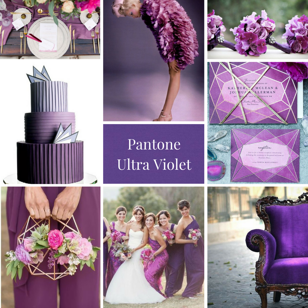
See more about my Ultra Violet mood board from the UK Academy of Wedding and Event Planning’s SS18 Pantone® mood board competition from earlier this year.

#COY2018