I’m not going to lie, I’m like a kid on Christmas Eve when I’m waiting with baited breath for the Pantone® announcements. For three times a year, I feel like a proper journalist waiting for the news to break about the next season’s top colours. (And I’m nearly beside myself waiting for the colour of the year announcement in December!)
Yes, I get excited! So when the fashion week season kicks off (this month is New York, London, Milan and then Paris) I’m on stand by waiting for Pantone® to make their declaration.
And it was quite a delay this time, as Pantone® waited until not only after New York Fashion Week to finish, but London as well. Whilst the fashion crowd have now moved on to Milan, I was beginning to think that Pantone® weren’t going to reveal a colour report at all this time. And if I may moan about Pantone® for one minute, I must say that I’m disappointed that it is less about their predictions now and more just about counting colours that designers have used. Don’t get me wrong, their report is comprehensive and incredibly impressive (blimey, there were around 180 shows at NYFW alone!) but I guess I feel it’s less about foresight in advance now.
However, it is good that their analysis is taking more of an international view for the first time and this report is a great overview of fashion designers’ use of colour in their Autumn/Winter 2017/2018 collections.
Plus I’ve already fallen deeply in love with the collection of colours that will trend this Autumn. Don’t get too excited. There’s no huge surprises. In fact, I probably could’ve written this article without even seeing the colours as they’re fairly typical and what you’d expect.
But they are a beautiful, rich collection of classic autumnal colours.
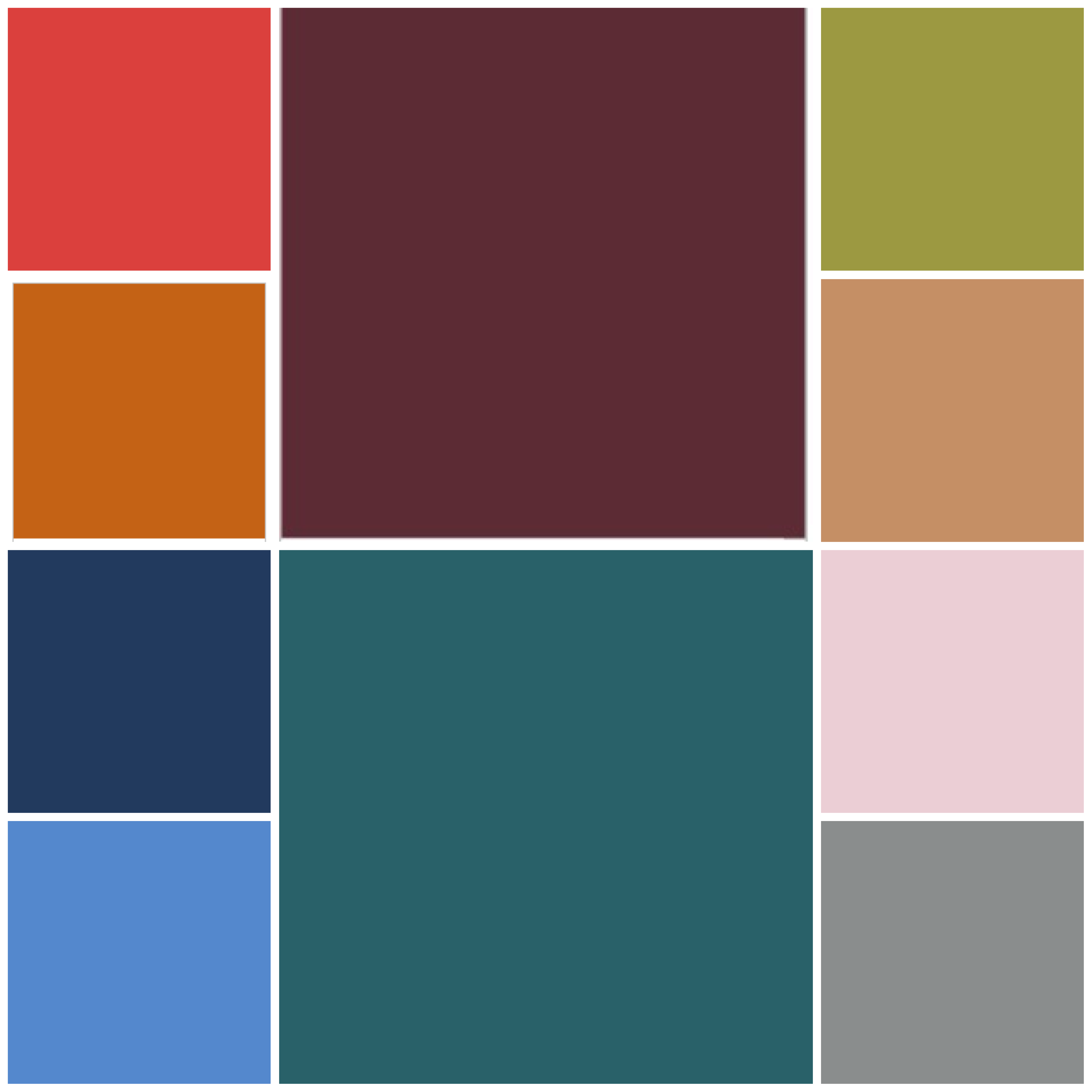
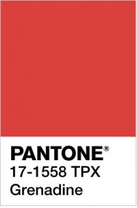
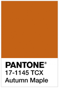
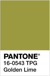
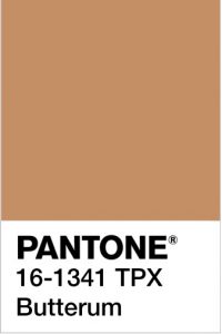
Looking at them makes me want to run, jump, kick and roll in a pile of crunchy fallen leaves all in the vibrant hues of Grenadine, Autumn Maple, Golden Lime and Butterum.
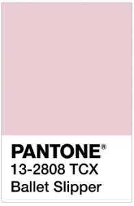
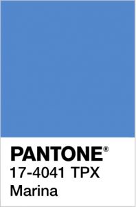
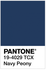
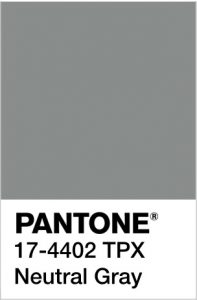
Even the distinctive, pale pink Ballet Slipper sits well with the cooler, wintry colours of Marina, Navy Peony and Neutral Gray.
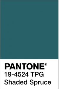
For me, the stand out colour is Shaded Spruce, a rich warm dark teal colour, which is a wonderful evolution of the Greenery colour of the year. It will take us from the freshness of spring/summer to the evergreen foliage of the winter.
Pantone® Color Institute Executive Director Leatrice Eiseman was right when she said that, “Cocooning colors are something you just want to wrap around yourself and feel comforted.”
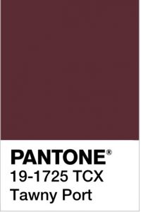
New York and London fashion weeks were full of tactile fabrics such as fur, velvet, quilting and tweed with a bit of Hollywood glam. These Fall/Winter 2017/2018 colours are Hygge at its best – comforting and cosy. How warming would that glorious and rich Tawny Port be to sup apres ski!
I also love the combination of the grey and yellow (maybe next year we’ll finally have a yellow as the colour of the year!) as it feels like such a comforting ray of sunshine.
The top ten colours from NYFW for Fall 2017 are:
- PANTONE 19-4524 TCX Shaded Spruce
- PANTONE 17-1558-TPX Grenadine
- PANTONE 17-1145-TCX Autumn Maple
- PANTONE 13-2808 TCX Ballet Slipper
- PANTONE 16-0543 TPG Golden Lime
- PANTONE 17-4041 TPX Marina
- PANTONE 19-4029 TCX Navy Peony
- PANTONE 17-4402-TPX Neutral Gray
- PANTONE 16-1341 TCX Butterum
- PANTONE 19-1725 TCX Tawny Port
Plus these from LFW (which are pretty similar to the ones from New York apart from a very welcome addition of a purple, a dark neutral brown and a fabulous yellow in the mix):
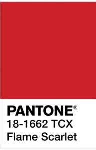
- PANTONE 18-1662 TCX Flame Scarlet
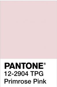
- PANTONE 12-2904 TPG Primrose Pink
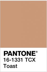
- PANTONE 16-1331 TCX Toast
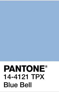
- PANTONE 14-4121 TPX Blue Bell
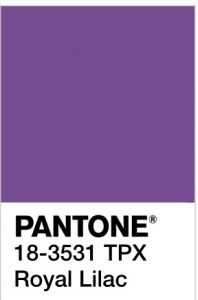
- PANTONE 18-3531 TPX Royal Lilac
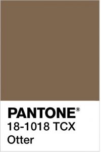
- PANTONE 18-1018 TCX Otter
- PANTONE 18-4028 TCX Navy Peony
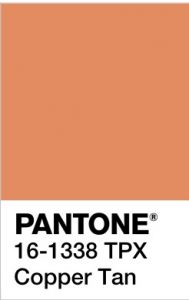
- PANTONE 16-1338 TPX Copper Tan
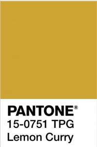
- PANTONE 15-0751 TPG Lemon Curry
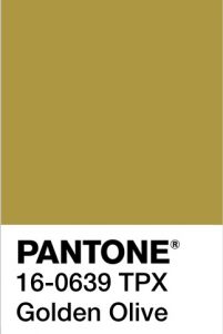
- PANTONE 16-0639 TPX Golden Olive
It’ll be great to see how couples incorporate these colours in to their weddings later this year (and whether the luxurious fabrics and sheer tops will influence wedding dress designs).
Pantone® is the world-renowned authority on colour and the Pantone® Color of the Year is always really influential in any popular colour themes in fashion, interior design and weddings.
See some of my other trend predictions for weddings in 2017.



Ohhhhh I’m loving that spruce and all those shades of blue!!!
Yes! So exciting, this makes me happy! Thanks for sharing!
I love the Tawny Port and Shaded Spruce, they go so well together! I’m not into the yellow but I like the darker colors, I think I might be in fashion this autumn!