The children are only just back to school today so I was surprised to see the news from Pantone® about Spring 2018 colours landing on my desk already – how exciting!
Their timing to announce the next season’s colours has been much earlier this time around and ahead of all the fashion weeks. In February, we were left waiting until after both New York and London Fashion week to announce their Fall 2017 fashion report. But the Spring Summer 2018 New York fashion week isn’t due to kick off until tomorrow so I wasn’t expecting Pantone® to announce their colour forecast just yet. It’s great to see their report is going back to being a forecast rather than a colour counting exercise from the catwalks though.
So not only is their timing unexpected but so are the colours – both in quantity and palette.
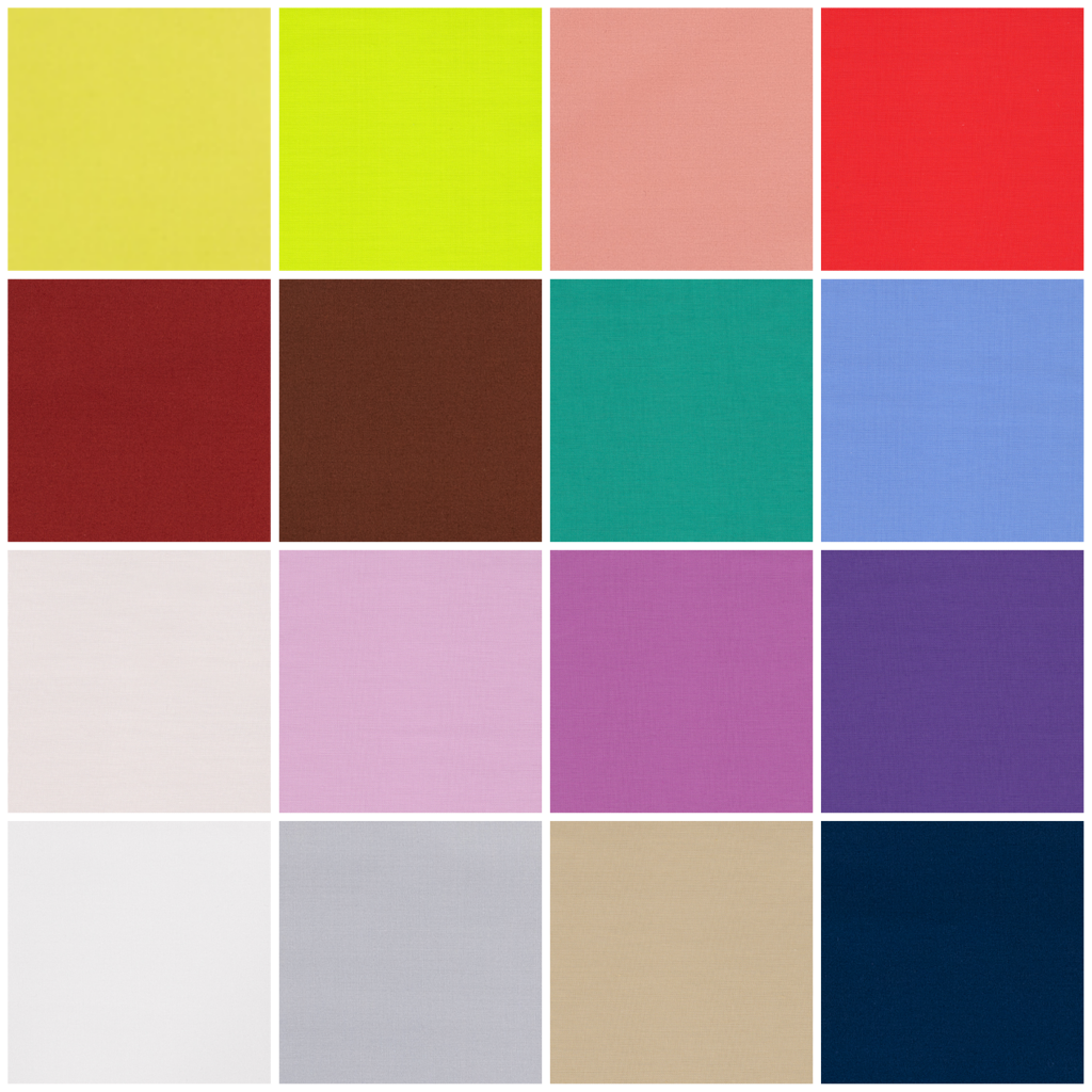
This season, instead of the usual 10 colours, we’ve been given an extra 2 to make 12 colours that Pantone® forecast to be the colours for Spring/Summer 2018. As if that wasn’t enough, they’ve also thrown in 4 bonus colours that act as neutrals and core basics.
I am so pleased to see yellow featuring high on their list – it’s such a comforting ray of sunshine. Does this mean that we’ll finally see a yellow as the colour of the year in 2018? I’ve been desperate for a yellow (or an orange colour) to get top billing for a couple of years and I cross everything for a bright colour like Meadowlark to take the top slot.
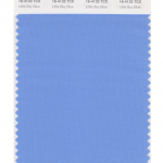
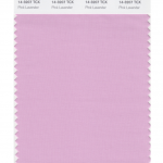
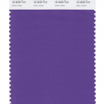
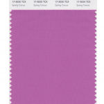
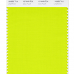
These Spring colours are certainly attention grabbing and there’s even a neon yellow amongst them. For me, I love that they are continuing the Spring 2017 trend away from pale pastels. This palette is right up my street! I love the blues (Little Boy Blue and Sailor Blue) and how these evolve in to my favourite colour of purple. With Pink Lavender, Ultra Violet, Almost Mauve and Spring Crocus.
The pastels that are used are barely-there colours and really work with the trend for gentle, ethereal and floaty materials and textures that are featuring in bridal attire at the moment.
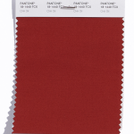
I also like the food based colours that show a real culinary influence of Cherry Tomato and Coconut Milk, with a bit of added spice from Chili Oil.
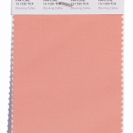
Along with this is some wonderful floral inspiration for a beautiful spring meadow such as Blooming Dahlia, Spring Crocus, and Pink Lavender.
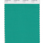
Plus the evolution of green continues in to this season. From the freshness of Greenery for Spring/Summer 2017 (and colour of the year in 2017), to the evergreen foliage of Shaded Spruce from Fall/Winter 2017, to a wonderful teal colour in Arcadia next Spring/Summer 2018 that mixes calming blue in to the green mix.
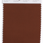
There’s also some unexpected earthy autumnal colours (like Chili Oil and the rich chocolatey brown of Emperador) that seem a little out of place from a traditional Spring palette but will act as great transitional colours to take us in and out of seasons.
The top twelve colours from NYFW for Spring 2018 are:
- Meadowlark 13-0646
- Cherry Tomato 17-1563
- Little Boy Blue 4132
- Chili Oil 18-1440
- Blooming Dahlia 15-1520
- Pink Lavender 14-3207
- Arcadia 16-5533
- Ultra Violet 18-2828
- Emperador 18-1028
- Almost Mauve 12- 2103
- Spring Crocus 17-3020
- Lime Punch 13-0550
Plus these from LFW (which are pretty similar to the ones from New York apart from the addition of another blue, a couple of wonderful dusky pinks, a warm burgundy and a fresh green):
- Cherry Tomato 17-1563
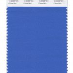
- Palace Blue 18-4043
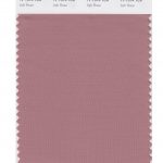
- Ash Rose 17-1514
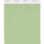
- Nile Green 14-0121
- Meadowlark 13-0646
- Blooming Dahlia 15-1520
- Ultra Violet 18-2828
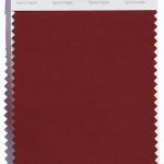
- Spiced Apple 18-1325
- Pink Lavender 14-3207
- Almost Mauve 12- 2103
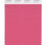
- Rapture Rose 17-1929
- Lime Punch 13-0550
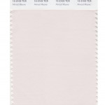
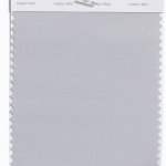
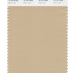
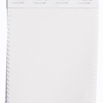
Pantone® have also created a Spring 2018 Classic Colour Palette. These are a group of neutrals that are core basics in the form of navy, grey, beige and off white (of Sailor Blue, Harbor Mist, Warm Sand and Coconut Milk respectively).
The bonus classic neutral colours for Spring 2018 are:
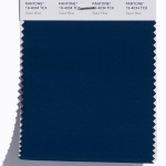
- Sailor Blue 19-4034
- Harbor Mist 14-4202
- Warm Sand 15-1214
- Coconut Milk 11-0608
It’ll be great to see how couples incorporate these colours in to their weddings next year. I can see how the classic neutrals will play a big part in coupling up with some of the more vibrant choices.
Pantone® is the world-renowned authority on colour and the Pantone® Color of the Year is always really influential in any popular colour themes in fashion, interior design and weddings.
See some of my trend predictions for weddings in 2017 and look out for my report when the 2018 colour of the year is released later in the year.
