The current back to school vibe always makes me feel a little sad and melancholy. It’s the end of the summer and the seasons are beginning to change. It is back to work and back to reality, after a summer of fun. The lyrics of ‘Zorbing’ by Stornoway sum up what this time of year makes me think about
Conkers shining on the ground, The air is cooler. And I feel like I just started Uni.
But the exciting news from Pantone® ahead of New York Fashion Week about the Spring 2019 colours has certainly lifted my mood.
We’ll be seeing red next spring if the latest trend predictions from Pantone® this week are anything to go by.
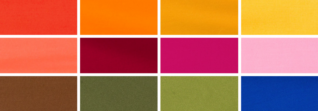
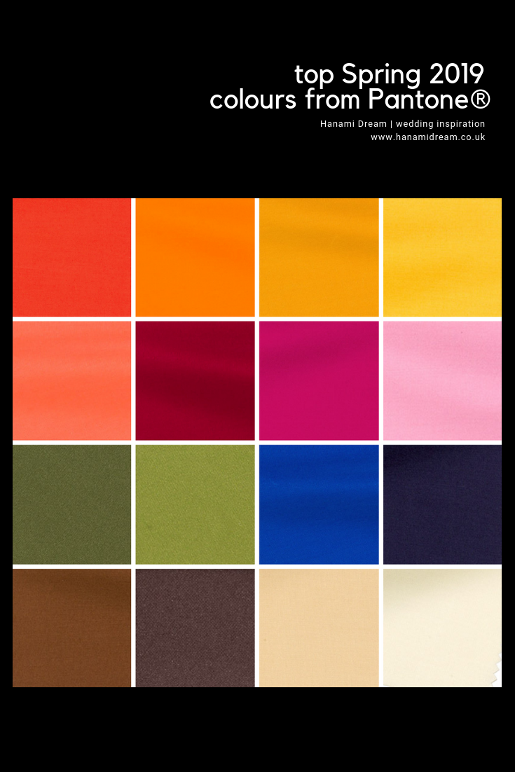
The colours for next Spring certainly make a huge bold statement. They are rich, vibrant and indulgent yet not over powering. They are like a ray of golden light on a colourful kaleidoscope.
Autumnal evolution
You’d be forgiven in thinking that this is the fall report and not the spring one. There seems to be quite a lot of crossover with the current Fall/Winter 2018/19 colour palette with some rich earthy tones, though by Spring 2019 we will have lost the purples (and the Colour of the Year), neons and silver grey.
It is great to see such earthy colours featuring in Spring 2019 and hardly a pastel shade in there! These are all great transitional colours to take us in and out of seasons.
Confident red
The abundance of red related colours is over whelming and runs in to the oranges, yellows and pinks too. This set of colours are empowering, confident, bold, uplifting, fun, playful, cheerful and joyful. Plus I can’t fail to see the energy, passion and excitement that these colours evoke.
My best friend always advises to wear red to an interview or an important date (even if it’s just your underwear!) so that you feel strong and confident. There will be lots around next Spring to feel like you can rule the world.
Foliage and succulents
That warm feeling is translated in the addition of the deep greens that conjure up a terrarium full of succulents and foliage. Continuing that sense of bringing nature inside.
Spring 2019 colours
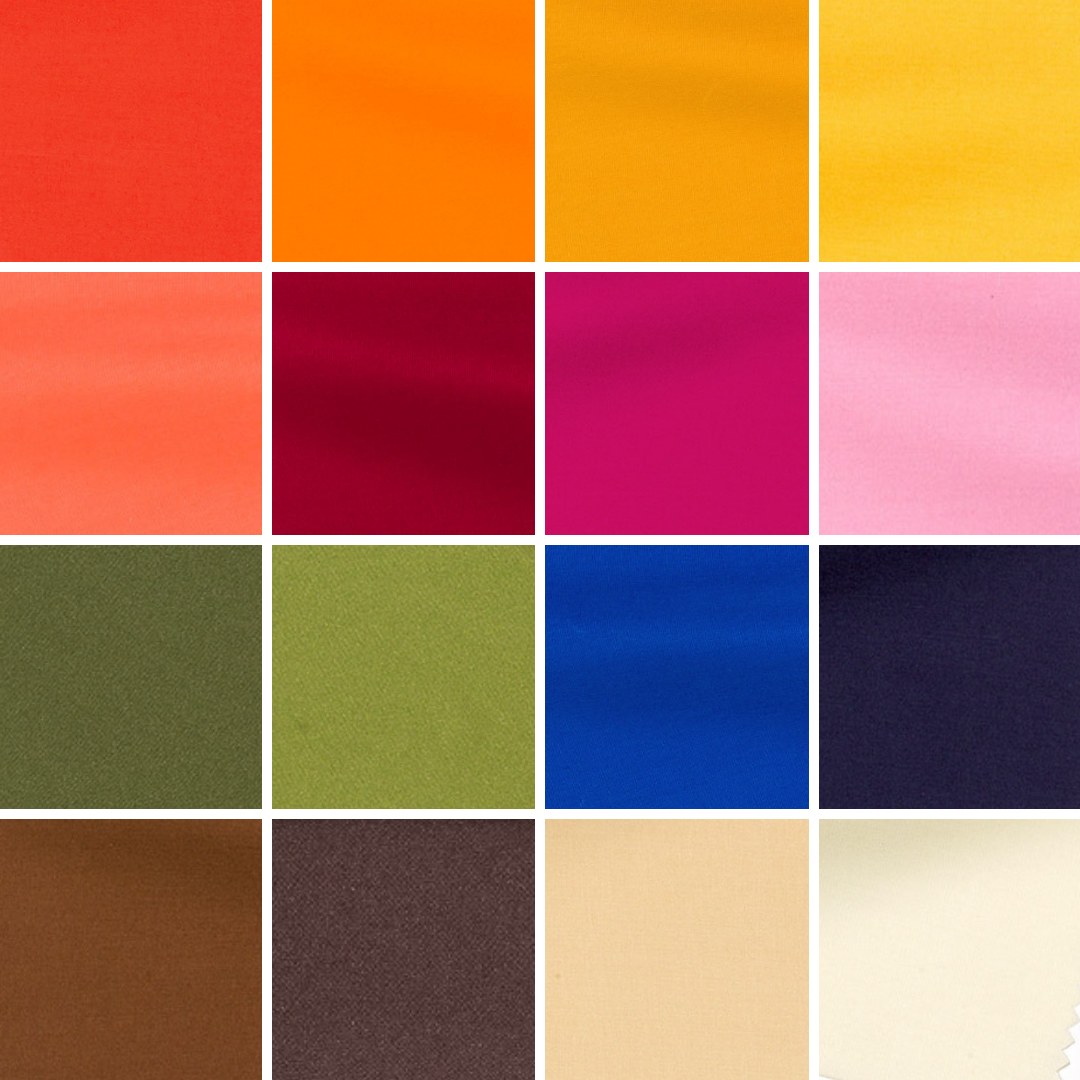
The top twelve colours for Spring 2019 are:
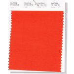
- Fiesta PANTONE 17-1564
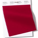
- Jester Red PANTONE 19-1862
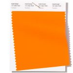
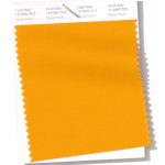
- Turmeric PANTONE 15-1264
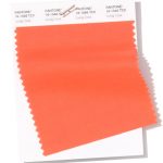
- Living Coral PANTONE 16-1546
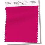
- Pink Peacock PANTONE 18-2045
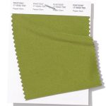
- Pepper Stem PANTONE 17-0542
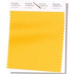
- Aspen Gold PANTONE 13-0850
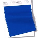
- Princess Blue PANTONE 19-4150
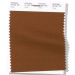
- Toffee PANTONE 18-1031
- Mango Mojito PANTONE 15-0960
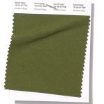
- Terrarium Moss PANTONE 18-0416
- Sweet Lilac PANTONE 14-2808
Spring 2019 extra colours from LFW
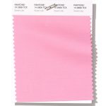
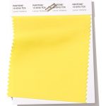
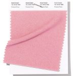
Plus a couple of paler substitutes of yellow (instead of Aspen Gold) and pink (instead of Sweet Lilac) from London Fashion Week round off the colours for Spring 2019:
- Lemon Verbena PANTONE 12-0742
- Pressed Rose PANTONE 15-1619
-
Neutral basics
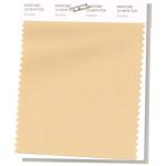
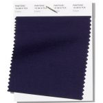
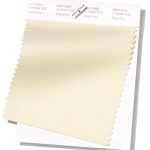
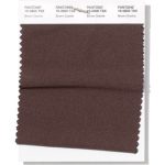
Pantone® have also updated the Classic Colour Palette. These are a group of neutrals that are core basics in the form of a taupe, navy blue, cream and brown.
The bonus classic neutral colours for Spring 2019 are:
- Soybean PANTONE 13-0919
- Eclipse PANTONE 19-3810
- Sweet Corn PANTONE 11-0106
- Brown Granite PANTONE 19-0805
Colour themes
It’ll be great to see how couples incorporate these colours in to their weddings later this year. I can see how the classic neutrals will play a big part in coupling up with some of the more vibrant choices.
Pantone® is the world-renowned authority on colour and the Pantone® Color of the Year is always really influential in any popular colour themes in fashion, interior design and weddings.
See some of my trend predictions for weddings in 2018 and look out for my report when the 2019 colour of the year is released later in the year.
So sporting my new statement red jeggings I feel not only empowered but raring to go for the new season.
Sign up to receive the latest wedding planning tips, tools, trends and traditions straight to your inbox.

