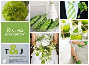
“Nicola’s consistent use of images featuring mums throughout her board lends a wonderful cohesive feel—it feels like all of these images could have come from one wedding. (Sometimes, mood boards can feel disjointed because images are pulled from so many different sources. This one didn’t have that issue at all.)
The even balance of colors feels professional. Greens, whites, and blacks are all placed well throughout the board—there’s no “too much” of any one color in any one spot.
This board’s imagery helps to convey a number of different aspects of a wedding. We love that Nicola included everything from cake design to typography inspiration. Overall, her board communicates a wedding that is fun, modern, and organic.
Christina Farrow, Aisle Planner – October 2016
http://community.aisleplanner.com/pantone-mood-board-competition/


